Gradient Color Combinations: The Best Pairings for Fashion and Art
How to Choose Gradient Color Combinations
A gradient works when the colors it connects share a natural transition path. The best gradient color combinations flow from one hue to another without producing a muddy middle tone where the colors meet. Understanding color theory – specifically how colors relate to each other on the color wheel – determines whether a gradient will be smooth and vibrant or flat and dull.
The strongest gradients connect colors that are adjacent on the color wheel (analogous colors) or that share undertones. Colors that are direct complements (opposite on the color wheel, like red and green or orange and blue) tend to produce brown or grey where they overlap, which usually kills the gradient rather than enhancing it. The exception is when complements are desaturated enough that the overlap reads as a neutral rather than mud.
The Color Wheel and Gradient Logic
Analogous Gradients
Adjacent colors on the color wheel produce the smoothest, most natural-feeling gradients. Orange to yellow, red to orange, blue to purple, green to teal – these transitions share enough of the same hue family that the blend point is clean and vibrant rather than muddy.
Analogous gradients are the default choice for sunset palettes, ocean-inspired color stories, and forest gradients. They feel naturalistic because the color transitions found in nature (actual sunsets, actual oceans, actual foliage) are fundamentally analogous – adjacent hues blending across the spectrum.
Triadic and Split-Complement Gradients
Gradients that span a larger portion of the color wheel – from one primary or secondary color past an intermediate toward a third – create more dramatic, high-energy transitions. Orange to pink to purple spans nearly half the warm side of the color wheel and is one of the most striking gradient combinations in contemporary fashion and design.
Monochromatic Gradients
A single hue transitioning from dark to light (or saturated to desaturated) produces a monochromatic gradient. Deep navy to pale sky blue.
Rich burgundy to blush. Forest green to mint.
These are the most refined and wearable gradient combinations – they read as sophisticated rather than bold, and work across contexts where vivid multi-color gradients might feel out of place.
Warm Gradient Color Combinations
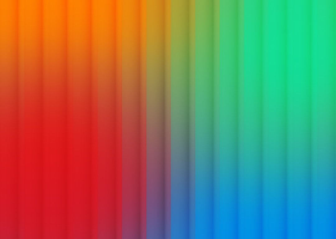
Sunset: Orange to Coral to Pink to Purple
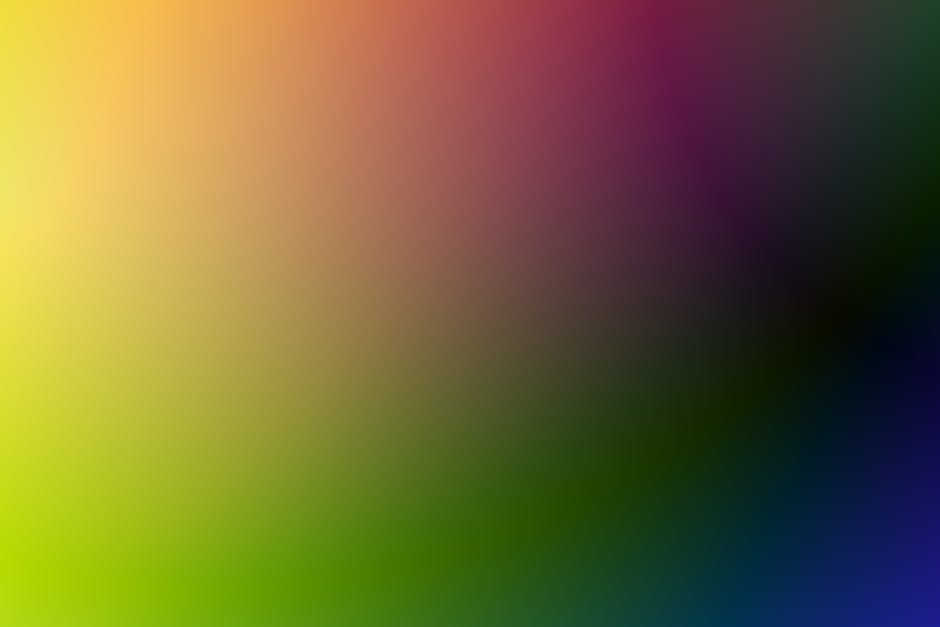
The most recognizable gradient combination in contemporary design and the palette at the heart of the COVL aesthetic. Moving through burnt orange or coral, transitioning into hot pink or magenta, and fading into soft purple or lavender, this combination mirrors the exact color sequence of a setting sun. It is vivid, warm, and deeply saturated when applied correctly.
Best applied over white – whether a white base coat in nail art, a white canvas for art, or a white fabric base for dye work – to allow the warm pigments to show their full saturation without being absorbed into a dark background.
Works for: Nail art, fashion prints, home decor, digital art, gradient typography
Fire: Red to Orange to Yellow
A high-energy gradient that moves through the full warm spectrum from red through orange to bright yellow. This combination is bold and graphic – it reads as heat, energy, and intensity.
It works extremely well in fashion graphics (printed on tees and hoodies) and in bold home decor contexts. It requires the most care in fashion wearables because it can read as aggressive if not balanced with neutral pieces.
Works for: Graphic print fashion, statement home decor, digital design, streetwear graphics
Warmth: Wine to Rose to Blush
A more refined take on the warm gradient. Deep wine or burgundy transitioning through rose pink to soft blush creates a monochromatic-adjacent gradient that feels romantic and elevated.
This is the most wearable warm gradient for professional and formal contexts. It works across fashion, nail art, and home decor without the intensity of full sunset palettes.
Works for: Fashion, nail art, home textiles, bridal aesthetics, refined streetwear
Earth: Sienna to Peach to Cream
An earthy warm gradient that replaces saturated pinks with desaturated, sandy tones. Burnt sienna at one end, fading through terracotta and peach to cream or warm white at the other. This is the most neutral-friendly warm gradient – it works with earthy fashion palettes, natural home decor, and skin-toned fashion without the boldness of sunset palettes.
Works for: Neutral fashion, natural home decor, spring/summer styling, minimal aesthetics
Cool Gradient Color Combinations
Ocean: Navy to Teal to Mint
The definitive cool gradient. Deep navy or midnight blue transitioning through teal and into bright mint green mirrors the color depth of ocean water from deep to shallow. This combination is vibrant without warmth and works particularly well in summer contexts, swimwear-adjacent fashion, and coastal-inspired home decor.
Works for: Summer fashion, nail art, sportswear, coastal home decor
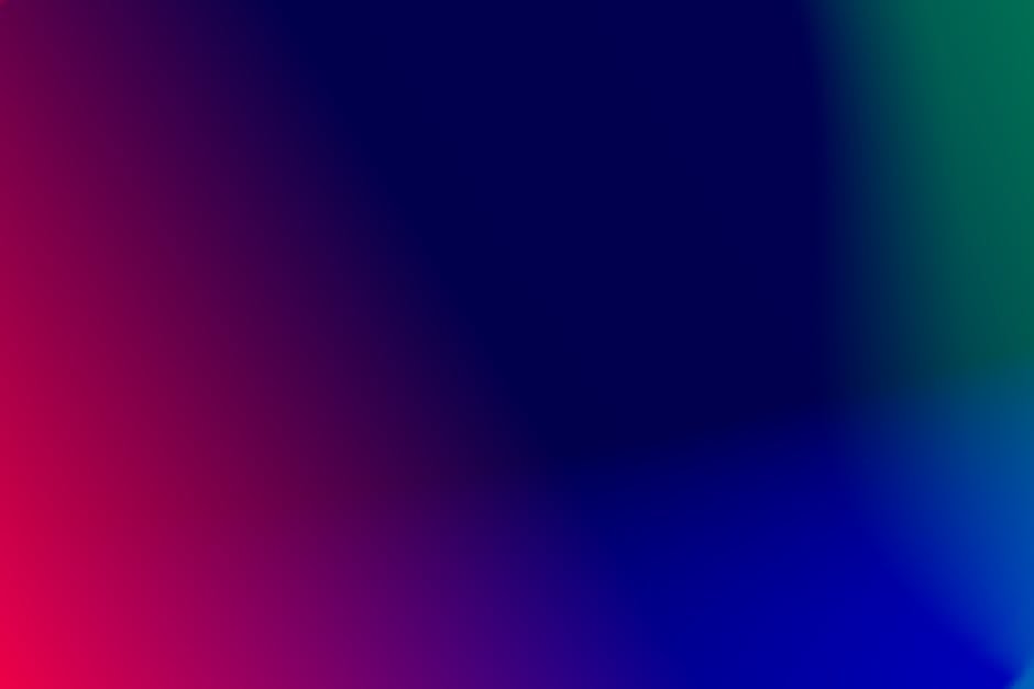
Twilight: Deep Purple to Blue to Periwinkle
The cool side of the sunset palette – the colors that appear just after the warm tones fade as night approaches. Deep indigo or violet, transitioning through medium blue, and fading into soft periwinkle. This combination has a mystical, atmospheric quality that works in fashion contexts where sunset palettes feel too warm and ocean gradients feel too blue.
Works for: Fashion graphics, nail art, bedroom decor, art prints
Forest: Emerald to Sage to Pale Green
A gradient that moves through the green spectrum from rich emerald to soft sage to near-white pale green. Forest gradients are increasingly popular in fashion as green has become one of the dominant colors in contemporary streetwear and art-forward fashion. The gradient reads natural and organic while maintaining the visual depth of any strong gradient combination.
Works for: Fashion, nail art, home decor, brand design, streetwear accessories
Cosmic: Deep Indigo to Lavender to White
Starting in near-black indigo and fading through medium purple to pale lavender and finally to white or near-white creates a gradient that evokes the depth of space and the quality of light through atmosphere. This combination is the most ethereal and high-fashion of the cool gradients – it appears frequently in editorial fashion photography and high-end streetwear art direction.
Works for: Editorial fashion, art prints, premium streetwear graphics, nail art

Neutral Gradient Color Combinations
Monochrome: Black to Charcoal to Grey
The darkest and most graphic neutral gradient. Moving from true black through charcoal to medium grey creates a gradient that works in contexts where color is not appropriate or desired. Monochrome gradients in fashion are particularly effective on outerwear, bags, and accessories where the gradient adds dimension without introducing color that might clash.
Works for: Fashion outerwear, bags, monochromatic styling, minimal home decor
Sand: Deep Brown to Tan to Cream
An earthy neutral gradient that moves through the brown family from dark to light. This combination is the most universally wearable gradient in fashion – it works with virtually any wardrobe, is appropriate across professional and casual contexts, and reads as refined rather than trend-driven.
Works for: Fashion, nail art, leather goods, home decor
Minimal: Nude to White
The most subtle gradient combination – a skin-toned nude fading to pure white. This combination is nearly imperceptible at a distance but adds depth and life to fashion pieces (particularly lingerie, bridal wear, and minimal fashion) that would appear flat in a single tone. In nail art, nude-to-white gradients are the most understated and elegant option available.
Works for: Minimal fashion, nail art, bridal, lingerie, soft home textiles
Pastel Gradient Color Combinations
Cotton Candy: Mint to Lavender
Soft mint green fading into soft lavender is one of the most beloved pastel gradient combinations. It appears across fashion, nail art, and home decor with equal success. The combination reads as playful and fresh without the saturation of vivid gradients, making it ideal for spring styling and everyday wearability.
Peach Dream: Baby Pink to Soft Peach
Two warm pastels connected in a gradient – pale rose pink transitioning into soft peach or apricot. This is the warmest of the pastel gradients and the most flattering next to a wide range of skin tones. It reads as warm and feminine without the boldness of full sunset palettes.
Springtime: Pale Yellow to Soft Green
Lemon yellow fading to pale sage green captures the color quality of new growth and spring light. This combination works particularly well for spring fashion, nail art, and home decor contexts where the softness of pastel gradients is the goal but warmth (pink, peach) is not the right palette direction.
How to Apply Gradient Color Combinations
Fashion
Gradient color combinations appear in fashion as dip-dye or tie-dye results, printed fabric patterns, color-block ombre garments, and fashion accessories. When wearing a gradient garment, keep the rest of the outfit simple – solid colors pulled from one end of the gradient to avoid competing with the color story built into the piece.
Nail Art
The sponge method produces the smoothest gradient nail results with any of the combinations listed above. Apply a white base coat first, then sponge the gradient colors in sequence. The closer the colors are on the color wheel, the smoother the blend will be at the transition point.
Home Decor
For gradient walls, choose two or three adjacent colors from a single gradient combination. Attempting too many colors in an ombre wall risks losing control of the blend and producing muddy transitions. Two well-chosen, adjacent colors produce cleaner, more impactful results than four colors attempted with less precision.
Digital Design
In digital design (graphic design, social media content, branding), gradient color combinations are used in backgrounds, typography fills, button states, and illustrative elements. The same color theory rules apply – analogous gradients blend cleanly while complements need careful management to avoid muddy overlap zones.
Pantone’s seasonal colour forecasts are a reliable reference point for gradient colour direction, since Pantone palettes directly influence how brands and designers select gradient combinations each season. WWD covered Pantone’s Spring 2026 NYFW colour trend report, which highlights the specific hue pairings and tonal directions shaping gradient design for the year.
Frequently Asked Questions
What two colors make the best gradient?
Colors adjacent on the color wheel produce the cleanest two-color gradients. Orange to yellow, blue to purple, red to orange, and teal to blue all blend smoothly. For the most striking single-transition gradient, deep burgundy to blush and navy to sky blue are both highly effective.
What colors are in a sunset gradient?
A sunset gradient moves through coral or burnt orange, hot pink or watermelon, and soft purple or lavender. Applied over white, these colors produce a vivid, warm gradient that directly references the color quality of a setting sun.
Do complementary colors work in gradients?
Direct complements (red-green, orange-blue, yellow-purple) tend to produce muddy brown or grey at the overlap point rather than a clean transition. They work best when the gradient has a neutral midpoint – white, cream, or grey – bridging the two complements rather than blending them directly together.