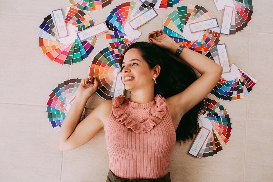
Color Palette Fashion: How to Build Outfits Around Color
Why Color Is the Most Powerful Tool in Fashion
Most people approach getting dressed by thinking about individual pieces. This tee goes with these jeans.
This jacket works with these trousers. The result is an outfit that functions but rarely feels visually considered – because thinking piece by piece ignores the most powerful tool available: color.
When you approach dressing through the lens of a color palette – a set of colors that relate to each other in a deliberate way – individual pieces become part of a system. The outfit becomes coherent because every piece shares a color relationship, not just because the items happen to go together.
This is how the most visually striking fashion is built. Not by finding pieces that match, but by building outfits around a color palette that creates a specific emotional and visual effect.
The Basic Color Relationships
Monochromatic
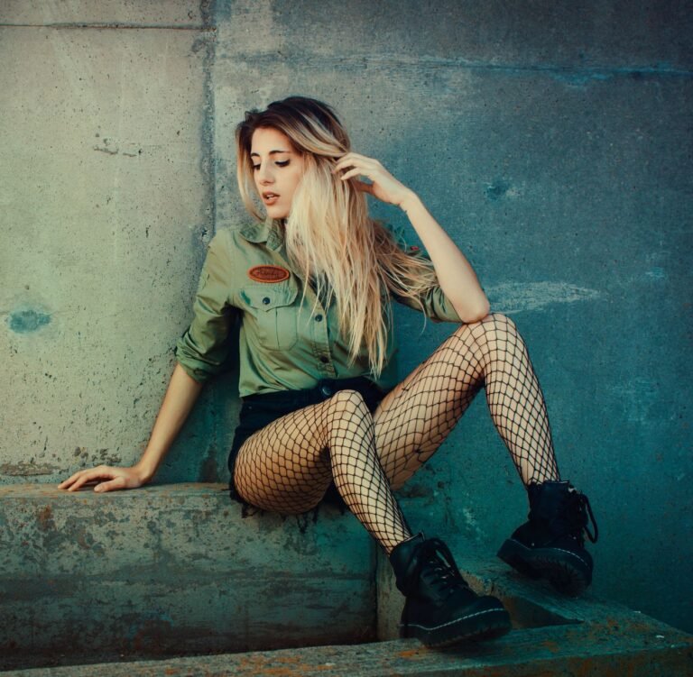
All pieces in the same color, varying only in value (light to dark) and saturation (vivid to muted). A monochromatic outfit in any color reads as sophisticated and considered because the commitment to a single hue looks intentional. The variation in value prevents it from appearing uniform.
Monochromatic dressing works in every color – an all-white outfit, an all-navy look, an all-rust autumn outfit. The gradient aesthetic is a natural extension of monochromatic dressing into garment design itself.
Analogous
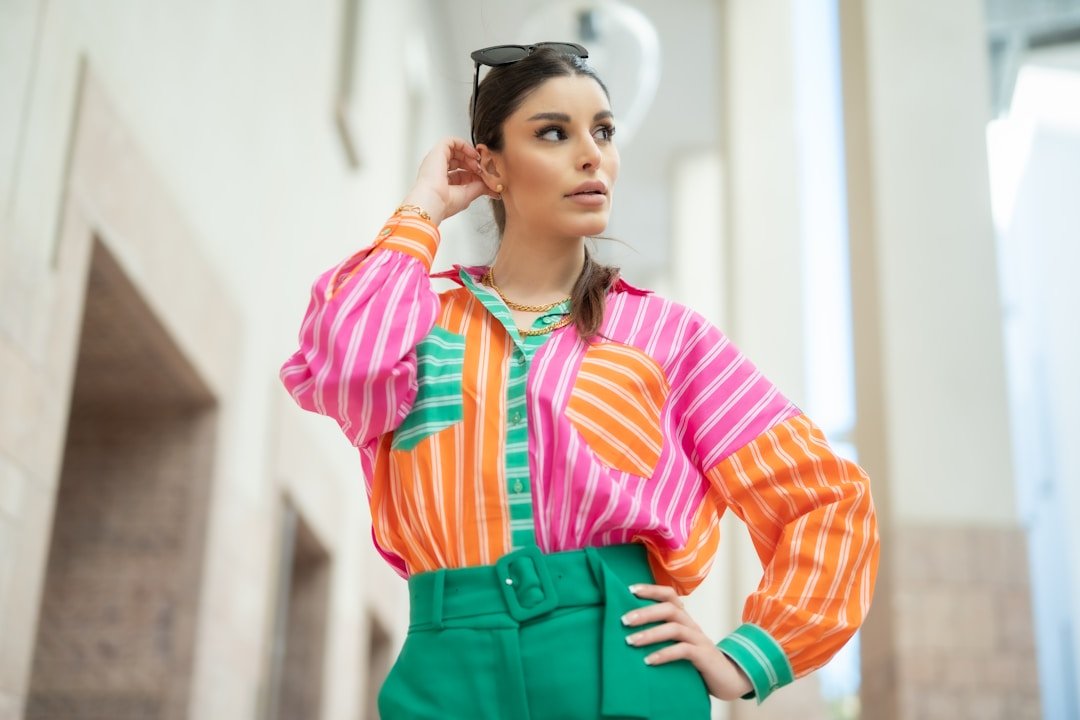
Colors that sit adjacent to each other on the color wheel – orange, coral, and pink, for example, or blue, teal, and green. Analogous color palettes feel harmonious because the colors share undertones and relate naturally to each other. The sunset palette – orange through pink to purple – is an analogous palette, which is part of why it is so universally appealing.
Complementary
Colors directly opposite each other on the color wheel – orange and blue, purple and yellow, red and green. Complementary pairings create maximum contrast and visual energy.
They are the boldest color combinations in fashion and require confidence to wear well. Kept to two pieces with clean silhouettes, they create unforgettable looks.
Triadic
Three colors equally spaced around the color wheel – red, yellow, and blue, or orange, purple, and green. Triadic palettes are vibrant and complex. They work best when one color dominates and the other two serve as accents, rather than splitting the outfit equally between all three.
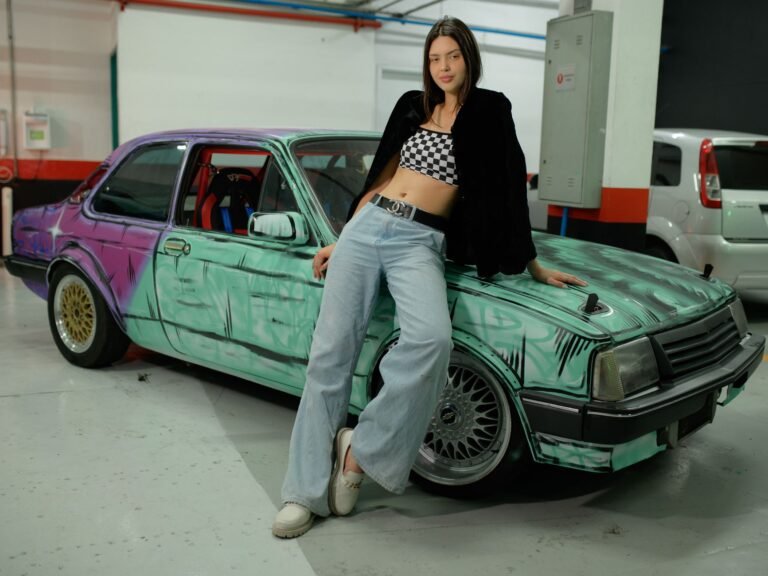
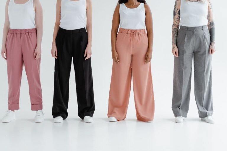
Neutral Plus One
A palette built from neutral tones – black, white, grey, cream, tan – with a single accent color. The most accessible way to introduce color into a wardrobe that defaults to neutrals. The accent color can be as bold as the wearer is comfortable with, and the neutral base makes any color combination work.
Building a Sunset Gradient Palette Outfit
The sunset gradient is one of the most compelling fashion color palettes because it is analogous, warm, and immediately emotionally resonant. Building an outfit around it:
- Anchor piece – a gradient garment that carries the full sunset palette, or a single bold sunset color like deep orange or hot pink
- Support pieces – neutral or tonal pieces that sit within the warm side of the palette. Cream, off-white, warm grey, tan
- Accent details – accessories that pull one specific color from the sunset spectrum. Orange bag, dusty rose beanie, warm-toned footwear
Color Palette Strategies by Aesthetic
The Bold Gradient Strategy
One gradient or vivid color piece carries the entire palette. Everything else is neutral.
The gradient piece does all the color work; the rest of the outfit gets out of the way. This is the most impactful use of a bold color piece and the simplest to execute – buy quality gradient pieces and pair them with clean basics.
The Tonal Strategy
Entire outfit in one color family across different values. Deep navy trousers, medium blue shirt, pale blue sneakers.
The palette is monochromatic but the variation in value creates interest. Works in every color and reads as effortlessly stylish because the commitment is total.
The Earth Tone Strategy
A palette built from natural, warm neutrals – rust, terracotta, ochre, warm tan, burnt sienna, deep brown. This palette photographs beautifully in natural light, works across all four seasons in appropriate fabrics, and suits a wide range of skin tones. Layer texture within the palette – a ribbed knit in rust against smooth cotton in ochre – for depth.
The Minimal Color Strategy
An almost entirely neutral outfit with one precisely chosen color moment. White tee, grey jeans, white sneakers – with a single coral bag or orange beanie.
The restraint makes the color moment impactful rather than overwhelming. This strategy requires confidence that the color choice is right, because everything else is stripped back to let it show.
Common Color Palette Mistakes in Fashion
Too Many Colors Competing
An outfit with more than three distinct colors rarely looks intentional unless one color clearly dominates. When orange, green, purple, and yellow all appear in an outfit at roughly equal weight, the eye has nowhere to rest. Establish a dominant color, a secondary color, and an accent – and keep it there.
Matching Too Precisely
Exact matching – the same color on every piece – looks less sophisticated than tonal coordination. Slightly different values of the same color look intentional; exactly matching separates look like a uniform or a mistake. Allow variation within the palette.
Ignoring Undertones
Colors that appear compatible in isolation can clash when worn together because their undertones conflict. A warm orange (yellow-based) and a cool pink (blue-based) are both within the sunset palette but can jar against each other at full saturation. Understanding warm versus cool undertones helps build palettes that cohere naturally.
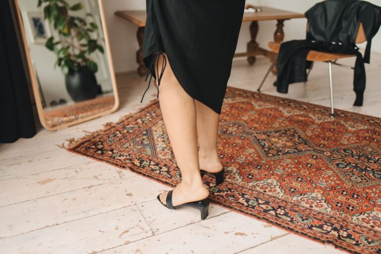
Forgetting Footwear in the Palette
Footwear is part of the outfit color palette. Shoes in a completely unrelated color family break the palette cohesion no matter how good the rest of the outfit is. Either keep footwear neutral and let it stay out of the palette conversation, or choose footwear that picks up a color from the palette deliberately.
Color coordination in fashion has evolved beyond matching into genuine palette-building. Who What Wear identifies the five standout colour combinations dominating fashion in 2026, from subtle tonal pairings to bold contrasts that demonstrate how deliberate color choices transform an outfit from functional to fully considered.
Frequently Asked Questions
How do you build a color palette for an outfit?
Start with your anchor piece and identify its dominant color. Choose a palette type – monochromatic, analogous, or complementary.
Select supporting pieces and accessories that fit within that palette, varying in value and texture. Keep the number of distinct colors to three or fewer for most outfits.
What is the easiest color palette to wear in fashion?
Neutral plus one accent is the most accessible. Build from black, white, grey, or cream basics and introduce a single accent color through one statement piece or accessory. It creates visual interest without requiring extensive color theory knowledge.
How does gradient fashion relate to color palette dressing?
Gradient garments are physical expressions of color palette theory – the color transition within a single piece creates a palette that the rest of the outfit can draw from. A sunset gradient hoodie gives you a ready-made analogous warm palette to build around. The gradient does the color theory work; you just need to support it with clean neutrals.