Sunset Gradient: The Complete Style Guide for 2026
What Is a Sunset Gradient?
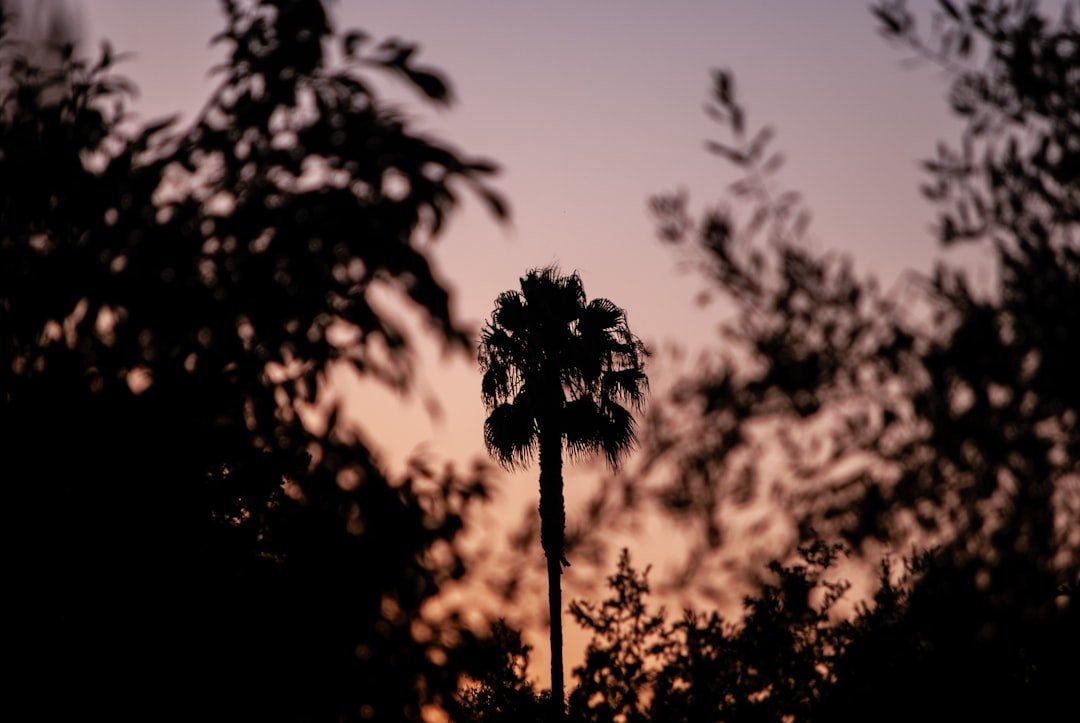
A sunset gradient is a color transition that mimics the natural palette of a setting sun – typically blending deep oranges, warm pinks, rich purples, and golden yellows into a seamless fade. Unlike a single solid color, a gradient moves from one hue to another in a smooth, continuous flow. The sunset version of this effect is one of the most recognizable and beloved color combinations in design, fashion, and digital art.
The appeal is universal. Humans are hardwired to find sunsets beautiful – they trigger warmth, nostalgia, and a sense of calm.
When those same colors appear on clothing, artwork, or interiors, they carry that same emotional weight. That is why the sunset gradient has moved well beyond digital design and into every corner of visual culture.
The Core Colors of a Sunset Gradient
Understanding the sunset gradient starts with its color palette. While no two sunsets are exactly alike, the classic sunset gradient typically pulls from these tones:
- Deep orange – the anchor warm tone, usually dominating the lower portion of the gradient
- Coral and salmon pink – bridges the orange into the pink range, softening the transition
- Hot pink and magenta – adds intensity and vibrancy as the gradient moves upward
- Soft purple and lavender – the cooler tone that balances the warmth, often used as the fade-out color
- Golden yellow – sometimes used as the base, especially in desert or tropical sunset palettes
- Deep indigo and navy – for dramatic sunset gradients that push into twilight territory
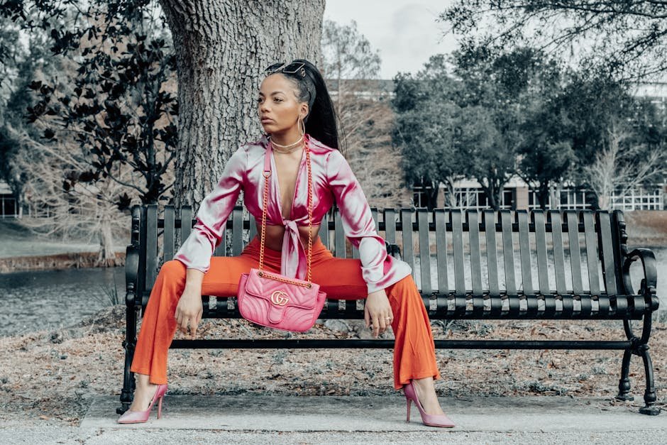
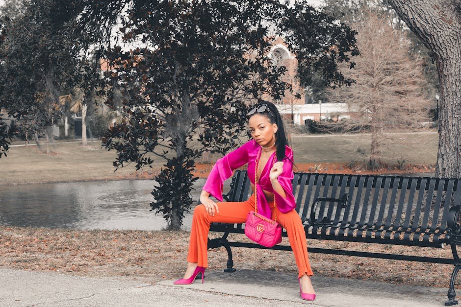
The most versatile version moves from orange through pink to purple. This trio works across fashion, interior design, graphic design, and digital art because it is warm enough to feel energetic but cool enough to feel elegant.
The enduring appeal of warm sunset tones in fashion is well documented. Who What Wear’s coverage of the sunset colour trend traces how these shades moved from the spring 2021 runways — appearing at Chloé, Rejina Pyo, and ACNE — into a lasting wardrobe staple across every season.
Sunset Gradient in Fashion
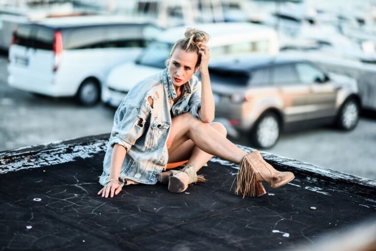
The sunset gradient made its leap from screen to streetwear in the late 2010s and has only grown since. What started as a digital art trend – Instagram artists experimenting with gradient fills on illustrations – became a defining aesthetic for a generation of independent clothing brands.
At COVL, the sunset gradient is part of our founding DNA. Our early Instagram work leaned heavily into gradient color work, and that translated directly into our first physical pieces. The response was immediate – people wanted to wear the colors they loved on their screens.
Gradient Hoodies
The hoodie is the ideal canvas for a sunset gradient. The large surface area of a pullover or zip hoodie allows a full gradient to breathe – moving from hem to hood in a slow, dramatic color transition.
Gradient hoodies work because they are a statement piece that requires no other styling effort. Pair with clean black or white bottoms and the hoodie does all the talking.
What to look for in a gradient hoodie:
- Full garment dye rather than a print – real gradient hoodies use a dye process, not ink on fabric
- Color transition that runs top-to-bottom or left-to-right, not patchy or blotchy
- Quality fleece or French terry construction – the weight of the fabric affects how the dye absorbs
- Colorfastness – cheap gradient hoodies fade unevenly after washing
Gradient Pants
Gradient pants are a bolder move than a gradient hoodie – they put the color on your lower half, which draws the eye differently. The most wearable versions use a subtle gradient, transitioning from a deeper shade at the waist to a lighter tone at the ankle. This mimics the natural shading effect in tailored clothing and feels more elevated than a full rainbow gradient.
Sunset gradient pants pair best with a neutral top – white tee, black crewneck, or an oversized solid hoodie. Let the pants lead. Avoid pairing with another printed or patterned piece unless the contrast is intentional.
Gradient Tees and Longsleeves
The most accessible entry point into gradient fashion. A sunset gradient tee can range from subtle – a soft ombre fade from peach to white – to full intensity with all five sunset colors blending across the chest.
For everyday wear, the softer versions integrate more easily into an existing wardrobe. For a statement fit, go full saturation.
Sunset Gradient in Digital Art and Design
Before it was on clothing, the sunset gradient dominated digital art. Instagram illustrators, graphic designers, and digital painters all gravitated toward sunset palettes because they photograph well, render beautifully on screens, and communicate emotion instantly.
In UI and graphic design, sunset gradients are used for:
- App backgrounds and splash screens – the gradient creates depth without distracting from UI elements
- Social media graphics – high contrast and warmth make sunset gradient posts stop-scroll worthy
- Brand identity – companies in wellness, beauty, and lifestyle sectors frequently use sunset palettes to communicate warmth and aspiration
- Wallpapers and digital prints – one of the most downloaded wallpaper categories across all platforms
For artists working in the sunset gradient space, the challenge is avoiding cliche. The palette is so widely used that standing out requires either an unexpected color combination – pushing the purple further into blue, or grounding the orange in brown – or an unusual application like 3D forms, textile patterns, or architectural photography.
How to Style the Sunset Gradient Aesthetic
Wearing a sunset gradient well is about balance. The colors are inherently attention-grabbing, so the rest of your outfit needs to support rather than compete.
Rule 1: One gradient piece per outfit
Unless you are intentionally going for maximalist layering, keep the gradient to a single item. One gradient hoodie, one gradient tee, or one gradient accessory. Everything else should be neutral or tonal.
Rule 2: Pull a color from the gradient for your other pieces
If your gradient hoodie moves from orange to purple, choose one of those colors for your accessories – orange sneakers, a purple bag, or a coral beanie. This creates cohesion without making the outfit feel accidental.
Rule 3: Neutrals are your foundation
Black, white, grey, and tan are the ideal base for sunset gradient pieces. They let the colors breathe. Denim works well too – the blue-grey of raw denim complements the warm tones in a sunset palette naturally.
Rule 4: Footwear matters more than you think
White sneakers are the safest choice with any gradient piece. They ground the outfit without introducing a new competing color.
Clean black or grey sneakers work just as well. Avoid loud colorways in your footwear when the gradient is already doing the work.
Sunset Gradient vs Other Gradient Styles
Not all gradients are sunset gradients. Understanding the distinctions helps when shopping or creating:
- Sunset gradient – warm oranges, pinks, purples. Emotional, nostalgic, energetic
- Ocean gradient – aqua, teal, deep blue. Calm, cool, aquatic
- Forest gradient – yellow-green through deep emerald. Natural, grounded, earthy
- Neon gradient – saturated electric colors, often used in Y2K and rave aesthetics. High energy, maximalist
- Pastel gradient – soft, desaturated versions of any gradient palette. Light, airy, minimal
- Monochromatic gradient – one color transitioning from light to dark. Sophisticated, clean
The sunset gradient sits in a sweet spot – it has more personality than a monochromatic gradient but more wearability than a neon gradient. That balance is why it has had such staying power in fashion and design.
Sunset Gradient in Home and Interior Design
The aesthetic does not stop at clothing. Sunset gradient has moved into interiors in a significant way – from ombre walls and gradient rugs to throw pillows and art prints that bring the palette into living spaces.
The most popular applications:
- Gradient walls – painted ombre walls moving from a deep rust orange near the floor to soft peach near the ceiling
- Throw blankets and pillows – accessible and removable, the easiest way to bring the sunset palette into a room
- Neon or LED lighting – programmable LED strips set to a sunset gradient create ambient lighting that shifts the entire mood of a space
- Art prints – sunset gradient art prints are among the most popular categories on platforms like Society6 and Redbubble
Frequently Asked Questions
What colors make a sunset gradient?
A classic sunset gradient uses deep orange, coral pink, hot pink or magenta, and soft purple or lavender. Golden yellow is sometimes added at the base, and deep indigo can extend the gradient into a twilight effect.
How do you make a sunset gradient in Photoshop or Illustrator?
In Photoshop, use the Gradient Tool with a custom gradient editor. Add color stops at #FF6B35 (orange), #F72585 (hot pink), and #7209B7 (purple).
Set the gradient type to Linear and drag across your canvas. In Illustrator, apply a gradient fill to any shape using the same hex values in the Gradient panel.
Is sunset gradient still in style in 2026?
Yes. The sunset gradient has proven itself as an enduring aesthetic rather than a passing trend.
While its peak social media moment was around 2019-2021, the palette has matured into a design staple. In streetwear specifically, gradient dye techniques continue to be used by independent brands as a signature aesthetic.
What is the difference between a sunset gradient and an ombre?
Ombre refers specifically to a single-color fade from dark to light or light to dark. A sunset gradient uses multiple distinct colors transitioning into each other.
All ombres are gradients, but not all gradients are ombres. A sunset gradient is always multi-color.
How do you wash gradient clothing without the colors fading?
Wash gradient garments inside out in cold water on a gentle cycle. Use a color-protecting detergent and avoid bleach entirely.
Air dry rather than using a dryer – the heat causes dye to break down faster. Washing less frequently also preserves gradient dye significantly.