Sunset Color Palette: The Complete Guide for Fashion and Design in 2026
What Is the Sunset Color Palette?
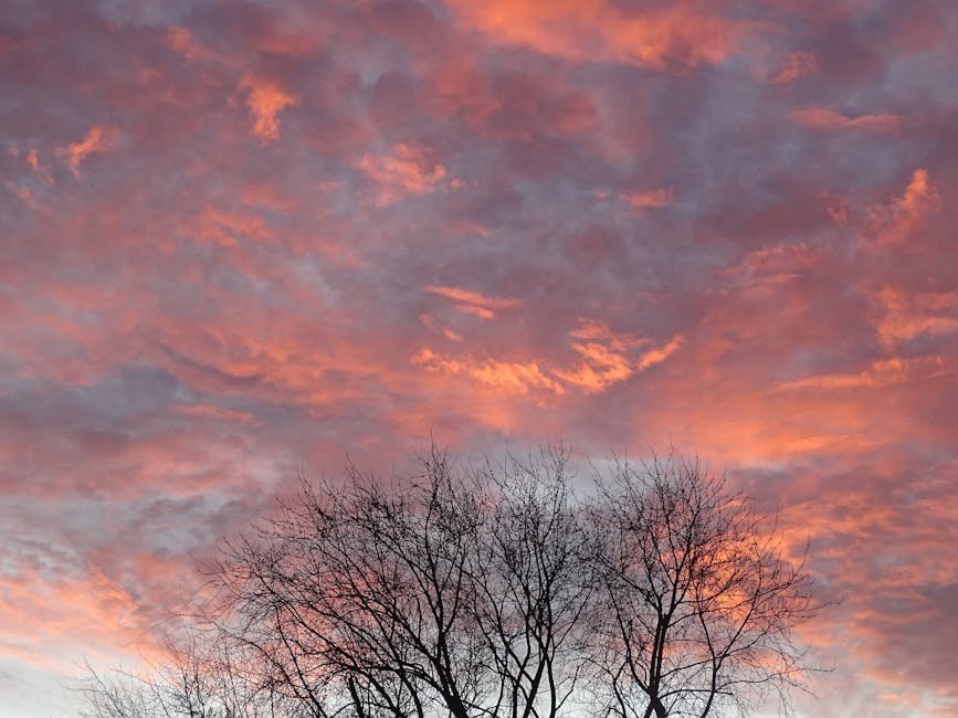
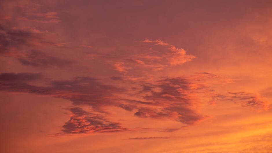
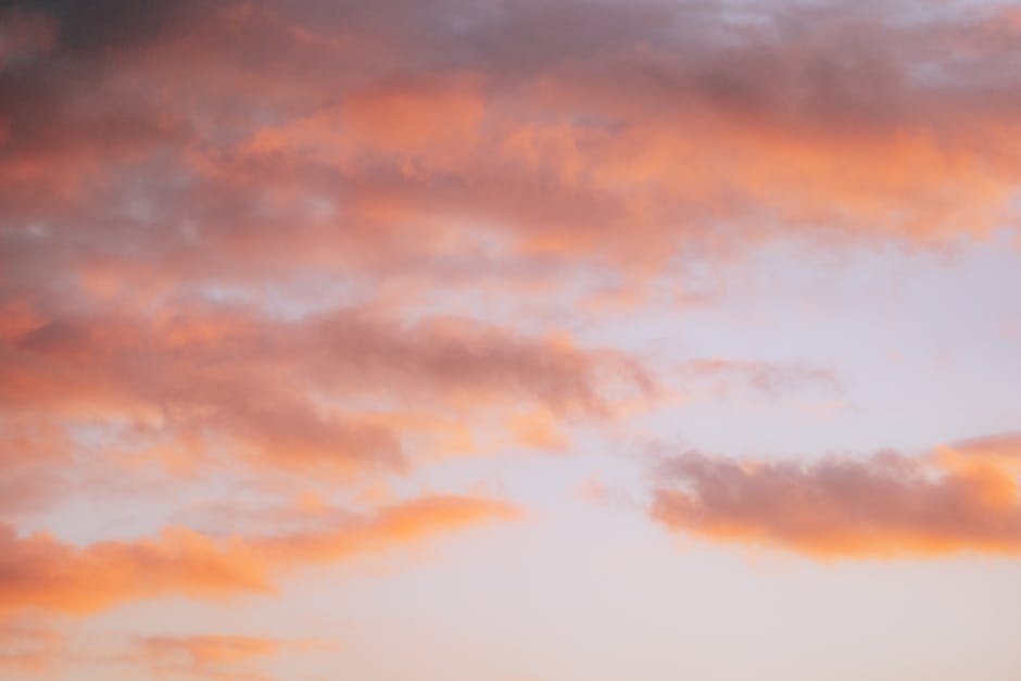
The sunset color palette is a spectrum of warm, saturated tones derived from the colors of the sky during golden hour and the transition into blue hour — roughly the thirty minutes before and after the sun drops below the horizon. The palette moves through amber, burnt orange, coral, hot pink, magenta, and deep violet, with the specific shades shifting depending on the day, the season, and the atmospheric conditions.
As a design and fashion reference, the sunset palette is one of the most versatile and emotionally resonant color systems available. The colors are warm without being harsh, vivid without being neon, and they carry an almost universal positive association — the setting sun is one of the most consistently beautiful visual experiences across all cultures and climates. That emotional grounding makes sunset palette applications in fashion and design feel instinctively right rather than arbitrary.
Core Sunset Palette Colors and Hex Codes
Golden Hour Tier
- Solar Gold — #F5A623: Warm amber-gold, the color of the sun itself just before it drops. Rich and saturated without reading as yellow.
- Burnt Amber — #E8721A: Deeper and more orange than Solar Gold. The dominant color of a classic autumn sunset at its peak intensity.
- Tangerine — #FF6B35: Bright, vivid orange with enough red to feel warm rather than citrus. The most immediately readable sunset tone.
Pink Hour Tier
- Coral Haze — #FF7B5C: The transition zone between orange and pink. Softer than pure coral, warmer than salmon.
- Sunset Pink — #FF5E8A: Hot pink with orange undertones. The color of the sky when the orange has faded and the pink takes over.
- Magenta Burn — #D4457E: Deeper, more saturated pink pushing toward magenta. The most dramatic moment in a vivid sunset.
Twilight Tier
- Dusk Violet — #8B4F9E: The pink transitioning into purple as the light fades. Warm enough to read as part of the sunset palette rather than a generic purple.
- Night Indigo — #3D2B6B: Deep indigo-purple, the sky color at the end of blue hour. The anchor of the sunset palette, grounding the warm tones above it.
- Horizon Blue — #4A90D9: The blue that appears above the warmth on a clear day — cool contrast that makes the warm tones below it more vivid.
Sunset Palette Combinations That Work
Classic Full Sunset
Solar Gold → Tangerine → Sunset Pink → Dusk Violet. The complete arc from warm to cool, covering the entire golden-to-twilight range.
Works as a gradient in design, or as a palette for multi-piece outfit building in fashion. This is the combination most people picture when they say “sunset palette.””
Warm Core Sunset
Burnt Amber → Coral Haze → Sunset Pink. Just the warm orange-pink core of the palette, omitting the violet and gold extremes. This subset is the most wearable and the easiest to apply in both fashion and interior design without the combination feeling costume-like.
Pink Sunset
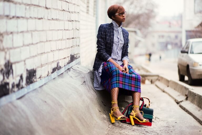
Coral Haze → Sunset Pink → Magenta Burn. The pink-dominant version of the sunset palette. Higher contrast and more vivid than the warm core, it reads more as a fashion statement and less as a nature reference.
Sunset and Neutrals
Any sunset tone paired with cream, off-white, sand, or warm grey. Adding neutrals to the sunset palette is how you make it work in everyday fashion and interior contexts.
A coral top with cream trousers reads as sophisticated and intentional. The same coral top with bright pink trousers reads as a full aesthetic look that requires more commitment.
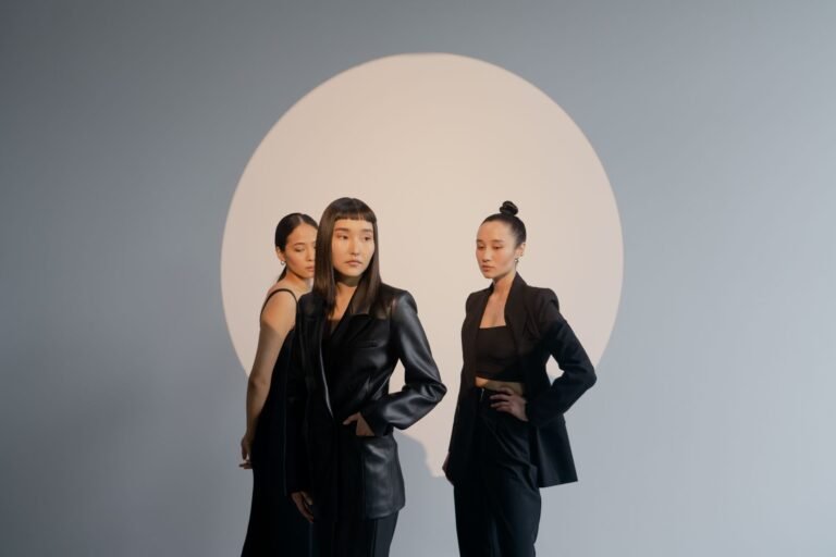
Sunset Color Palette in Fashion
Building a Sunset Palette Outfit
The most successful sunset palette outfits treat the gradient as a guide rather than a rule. You don’t need to replicate the exact sequence of the sky — the goal is to use tones from within the palette that feel harmonious together. Start with one anchor sunset tone and build from there.
Anchor in orange: A burnt orange or tangerine piece — oversized hoodie, wide-leg trouser, or bomber jacket — works as the foundation. Pair with coral or warm pink accents and neutral separates. Coral trainers, a pink bag, or a warm-toned accessory pulls the outfit into sunset territory without requiring head-to-toe commitment.
Anchor in pink: A vivid pink or magenta piece reads as a sunset reference when paired with warm rather than cool companions. A hot pink crewneck with rust-coloured denim and coral accessories stays in the sunset palette. The same pink top with blue jeans drifts out of it.
Full gradient: Wearing the gradient from top to bottom is the boldest application. Orange at the top, transitioning through pink to violet at the bottom — through a colour-block outfit, a tie-dye gradient piece, or coordinated separates. This is a statement look that works best in street style and creative environments.
Sunset Palette Pieces to Look For
- Gradient dyed hoodies and sweatshirts — the physical embodiment of the sunset palette in wearable form
- Tie-dye pieces in sunset colourways — orange, pink, and violet tie-dye is the most wearable version of the trend
- Colour-block separates in adjacent sunset tones
- Sunset-toned accessories — bags, caps, and trainers in coral, burnt orange, or warm pink are the easiest way to introduce the palette
- Printed pieces with photographic sunset imagery or abstract gradient prints
Sunset Palette by Season
Spring: Lean into the soft coral and blush end of the palette. Lighter fabrics in Coral Haze and Sunset Pink feel natural in spring light. Pair with white and cream.
Summer: The full vivid palette works in summer. Bold tangerine, hot pink, and saturated coral against bronzed skin and summer light. This is when the most saturated sunset tones are most wearable.
Autumn: Shift toward the deep amber and burnt orange end. Burnt Amber and Solar Gold are naturally autumnal tones. Layer sunset tones with camel, rust, and warm brown.
Winter: The Twilight Tier — Dusk Violet and Night Indigo — transitions into winter territory. Pair with black, charcoal, and dark neutrals to keep the palette seasonally appropriate.
Sunset Color Palette in Design
Brand Identity
Sunset palettes in brand identity signal warmth, creativity, and energy. They’re particularly effective for lifestyle brands, creative agencies, wellness brands, and any brand that wants to position itself as expressive and emotionally resonant. The risk with sunset palettes in branding is genericness — the palette is so widely used that differentiation requires either a highly specific subset of tones or a distinctive application method.
The most successful sunset-palette brands either work within a narrow two-tone version of the sunset spectrum (so their specific combination becomes recognizable) or combine sunset tones with an unexpected neutral — black instead of white, charcoal instead of cream — to create more contrast and personality.
Gradient Backgrounds and UI
Sunset gradients as background elements in digital products create warmth and visual interest without the busyness of patterns or photography. They work particularly well as hero backgrounds, app onboarding screens, and email header graphics.
The key constraint: ensure sufficient contrast between the gradient and any text placed over it. Deep violet or near-black text on Solar Gold works.
Mid-tone pink text on Sunset Pink does not.
Typography and Color Pairing
Sunset palette type works best in one of two modes: warm tones on a dark or neutral background (orange headline on black, coral body text on deep charcoal), or dark neutrals on a bright sunset background (black or dark brown headline on a coral or amber base). Mid-tone-on-mid-tone combinations within the palette reduce legibility and should be avoided for any text that needs to communicate clearly.
Sunset Palette in Interior Design
The sunset palette translates into interior design most naturally through textiles, ceramics, and accent pieces rather than wall paint. A full-wall sunset gradient is a strong statement that requires architectural commitment. The same palette applied through throw cushions, a terracotta pot, a coral rug, and warm amber lighting achieves sunset-palette atmosphere with flexibility.
Rooms with warm natural light — south or west-facing windows — are natural homes for sunset palette interiors. The actual golden hour light that comes through west-facing windows in late afternoon amplifies the warmth of sunset tones in the space in a way that artificial lighting cannot replicate.
Warm, saturated colour is one of the defining characteristics of the 2026 fashion landscape. Vogue’s guide to the key spring 2026 fashion trends reflects how sunset-adjacent tones — the oranges, pinks, and warm neutrals at the heart of the sunset palette — are being applied across the season’s most significant collections.
Frequently Asked Questions
What colors make up the sunset palette?
The core sunset palette includes amber gold, burnt orange, tangerine, coral, hot pink, magenta, and dusk violet — the range of colors visible in the sky from golden hour through twilight. The exact hex codes vary, but the most referenced tones are #F5A623 (amber), #FF6B35 (tangerine), #FF5E8A (sunset pink), and #8B4F9E (dusk violet).
What neutrals go with sunset colors?
Cream, off-white, sand, warm grey, and camel all work naturally with sunset palette tones. Black creates the highest contrast and is the most graphic pairing. Cool greys and stark white tend to make sunset tones look slightly garish — warm neutrals are the safer choice for most contexts.
Is the sunset palette in style for 2026?
Yes. Warm palette aesthetics have been strengthening since 2023 and gradient fashion and design have continued to gain traction through 2025 and into 2026. Sunset tones are a perennial reference — they trend cyclically rather than disappearing completely — and the current cycle is one of the stronger ones in recent years.