Gradient Typography in Brand Design: How Color Transitions Took Over Logos
The Rise of Gradient Typography
Gradient typography — lettering and wordmarks built around smooth color transitions rather than flat fills — has become one of the most visible trends in contemporary brand design. From streetwear labels to tech startups, social media platforms to fashion houses, gradient text now appears across almost every visual category where a brand wants to signal energy, modernity, and visual ambition.
The trend has its roots in digital design culture. As screen displays improved in color depth and gradient rendering quality through the 2010s, designers could finally create gradient fills that looked intentional rather than like a cheap early-2000s holdover. The Instagram logo redesign in 2016 — from flat camera icon to full sunset gradient — became the defining signal that gradients had been fully rehabilitated as a serious design tool.
Why Gradient Typography Works
At a technical level, gradient typography works because it adds dimension to a flat surface. A solid-fill wordmark sits at one plane. A gradient wordmark creates the impression of depth, light, or movement within the letterforms — the eye naturally follows the color shift across the word, adding a reading quality that flat fills do not produce.
The psychological effect depends on the palette:
- Sunset gradients (orange → pink → purple) read as warm, energetic, and social — which is why they dominate youth-facing and streetwear brands
- Cool blue-to-purple gradients read as tech-forward, sophisticated, and premium — used heavily in SaaS and fintech branding
- Monochromatic gradients (light to dark in one hue) read as clean and architectural — used in luxury and minimalist brands that want depth without color boldness
- Earth tone gradients read as organic and craft-forward — appearing in independent brands, sustainability-focused labels, and artisan goods
Gradient Typography in Streetwear Brand Design
Streetwear has adopted gradient typography faster and more extensively than almost any other fashion category. The reasons are rooted in the culture’s connection to digital art, screen printing aesthetics, and the visual language of social media — all environments where gradient fills thrive.
Independent streetwear brands use gradient wordmarks to:
- Stand out in an oversaturated market where flat-color logos blur together in a feed
- Signal authenticity through artisanal color work — a gradient suggests craft, not corporate
- Create garments where the typography itself is the artwork — gradient print hoodies where the brand name reads as a visual centerpiece
- Build a visual identity that works in social media contexts (profile images, bio links, story branding) as well as on physical product
Types of Gradient Typography Approaches
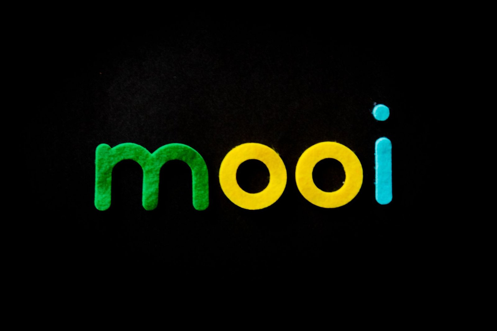
Linear Gradient Fill
The most common gradient typography technique. Color transitions in a straight line across the letterforms — left to right, top to bottom, or diagonally.
Clean and predictable, works at any size, and reproduces well across different media from screen to garment print. The Instagram wordmark uses a left-to-right linear gradient.
Radial Gradient Fill
Color transitions from a central point outward, or from the edges toward a center. Less common in typography because the focal point of the gradient needs to align with the visual balance of the word. Works well for single-word logotypes or wordmarks where the central letter is a natural anchor.
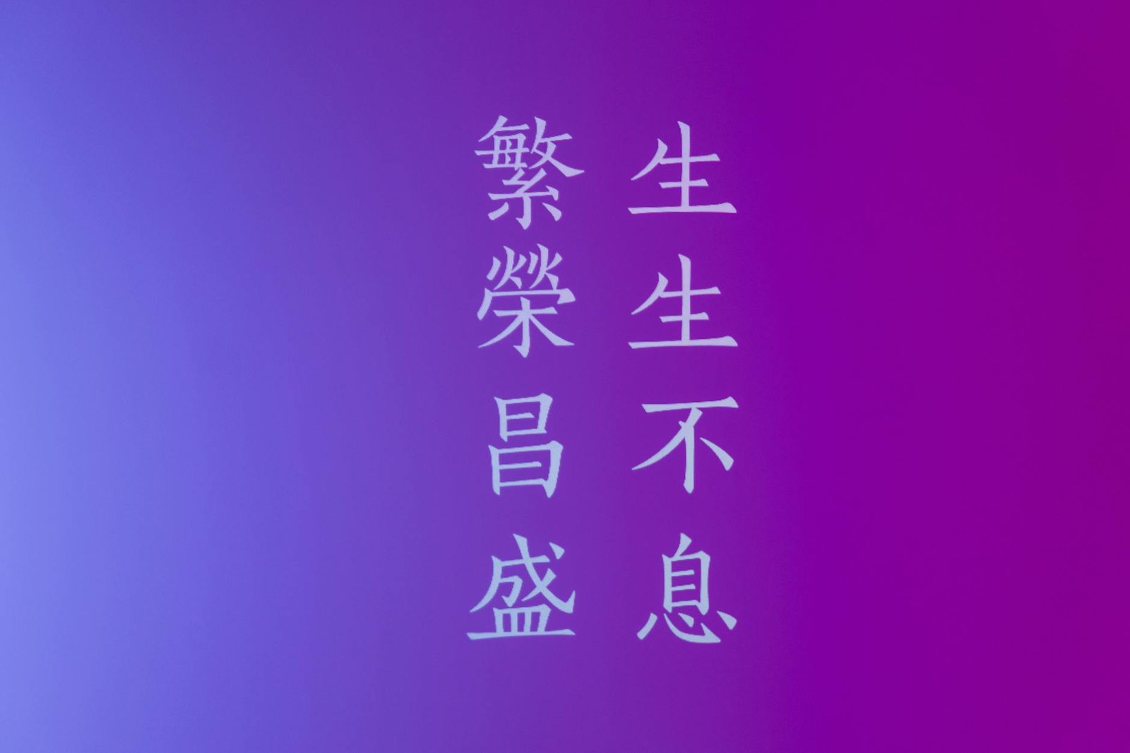
Per-Letter Gradient
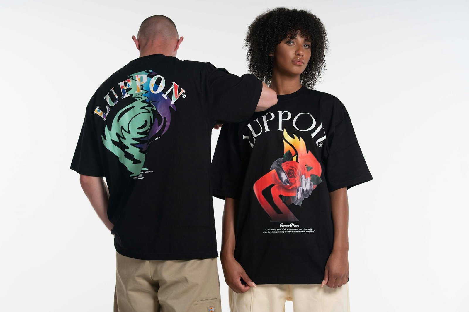
Each individual letter receives its own gradient fill — often cycling through the same palette in steps so the word reads as a progressive color sequence from first to last letter. This technique reads as playful and expressive, is associated with graffiti lettering influence, and appears frequently in streetwear and skate brand typography.
Chrome and Metallic Gradient
A specific gradient type that mimics the reflective surface of chrome or polished metal — typically moving between deep grey, bright near-white highlights, and dark shadows. Chrome gradient typography has a strong association with luxury goods, limited-edition drops, and Y2K aesthetic revival, making it a recurring pattern in premium streetwear releases.
Holographic Gradient
A multi-color gradient that cycles through the full spectrum in a tight shift — replicating the optical effect of holographic foil. When used in typography it reads as futuristic and exclusive, and has become strongly associated with limited-drop culture and collector-focused streetwear brands.
Making Gradient Typography Work: Design Principles
Gradient typography fails more often than it succeeds when applied without discipline. The principles that separate effective gradient type from visual noise:
- Font weight matters — gradient fills only read clearly in medium to heavy weight letterforms. In light or thin fonts the gradient transition does not have enough surface area per letter to register. Use bold, display-weight, or expanded typefaces for gradient fills.
- Limit the color count — the most effective gradient typography uses two or three colors maximum. More than three colors creates a rainbow effect that competes with the letterforms for attention.
- Background contrast is critical — gradient type needs a background that provides sufficient contrast to all colors in the gradient. A sunset gradient wordmark disappears on a warm-toned background. Dark or white backgrounds are the safest choices.
- Scale testing — gradient fills that look refined at large display sizes can become muddy or indistinct at small sizes. Test gradient wordmarks at thumbnail and favicon scale before committing.
- Print reproduction — screen gradients and print gradients are different technical problems. A gradient that renders beautifully on screen may require a separate print-optimised version for garments and physical media.
Gradient Typography and Garment Printing
For streetwear brands, the move from logo to printed garment creates specific constraints. Screen printing — the most common garment printing method — traditionally handles flat spot colors, not smooth gradients. Several techniques allow gradient typography to work on fabric:
- DTG (Direct to Garment) printing — digital inkjet printing onto fabric reproduces gradients accurately, similar to paper printing. Lower per-unit cost at short runs, limited to light base garment colors without pretreatment.
- Simulated process printing — screen printing technique that creates gradient effects by layering halftone dots of adjacent colors. Achieves gradient looks with screen printing economics at scale.
- DTF (Direct to Film) printing — transfers printed on film applied to garments reproduce gradients at high quality on any garment color. Increasingly popular for independent streetwear brands managing small batches.
Gradient Typography Trends in 2026
The gradient typography trend has matured past its early-adoption phase and split into distinct aesthetic camps. In 2026, the most active directions are:
- Subtle monochromatic gradients — single-hue gradient fills in brand colors, adding depth without bold color contrast. A premium positioning signal replacing the earlier multi-color gradient as brands mature.
- 3D gradient type — letterforms with dimensional extrusion rendered in gradient, mixing the gradient trend with the broader 3D typography movement in digital branding.
- Gradient-on-gradient — gradient wordmarks placed over gradient background sections, with careful palette management ensuring enough contrast. A deliberate maximalism used by brands with strong visual identities confident enough to layer complexity.
Colour wheel logic applies directly to gradient design — understanding which hues work together as gradients comes down to the same complementary and analogous relationships that govern fashion styling generally. Refinery29 breaks down creative outfit combinations using colour wheel principles, which translates directly into how gradient typography pairs with garment colourways.
Frequently Asked Questions
What makes gradient typography look professional versus cheap?
Font weight, color count, and background contrast are the three variables that separate professional gradient typography from dated-looking execution. Heavy typefaces with two- or three-color gradients on dark or white backgrounds read as intentional. Light typefaces with too many colors on busy backgrounds read as unresolved.
Which brands are known for gradient typography?
Instagram’s wordmark and the Spotify branding system are the most mainstream references. In streetwear, independent brands regularly use gradient wordmarks for garment graphics and social identity, often building an entire seasonal visual identity around a specific gradient palette that appears across drops, lookbooks, and digital content.
Is gradient typography still on trend in 2026?
Yes, though the trend has matured. The early wave of maximalist multi-color gradients has been followed by a more considered phase of selective gradient use — subtle, brand-specific palettes rather than universal sunset fills. The technique itself is well-established; it is the execution approach that continues to evolve.