Gradient Wall Art: How to Use Colour Flow in Interior Design
What Is Gradient Wall Art?
Gradient wall art uses smooth, continuous colour transitions — from one hue to another, or from a deep tone to a pale one — as the primary visual language. Unlike representational art or pattern-based decoration, gradient art generates its visual interest entirely through colour relationships and the way the eye perceives colour movement across a surface. The effect is simultaneously simple and visually complex: nothing is happening except colour, and yet colour is capable of generating enormous emotional and atmospheric effects within a room.
Gradient art has a long history in both fine art and design — from the colour field painters of the 1950s and 1960s (Mark Rothko, Helen Frankenthaler, Morris Louis) to the digital design language of the 2010s and 2020s. What makes gradient wall art particularly compelling in 2026 is the combination of its digital-era familiarity as a visual language — the gradient is native to screen interfaces — and its ability to create analogue, atmospheric quality when rendered in paint, textile, or print.
Types of Gradient Wall Art
Canvas Gradient Paintings
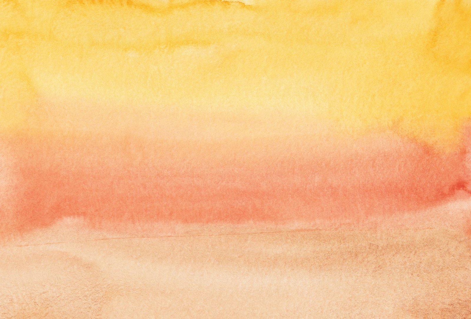
Gradient art painted directly onto canvas — from small-format prints to large statement pieces. Canvas gradients can be oil-painted for depth and richness, acrylic for colour intensity and accessibility, or watercolour for the soft, bleeding quality that watercolour creates naturally as colours meet.
Canvas gradient paintings range from hand-painted originals through artist-made prints to high-quality reproduction prints. The format is the most versatile for placement — any size, any orientation, can be hung at any height with standard picture-hanging hardware.
Abstract Gradient Prints
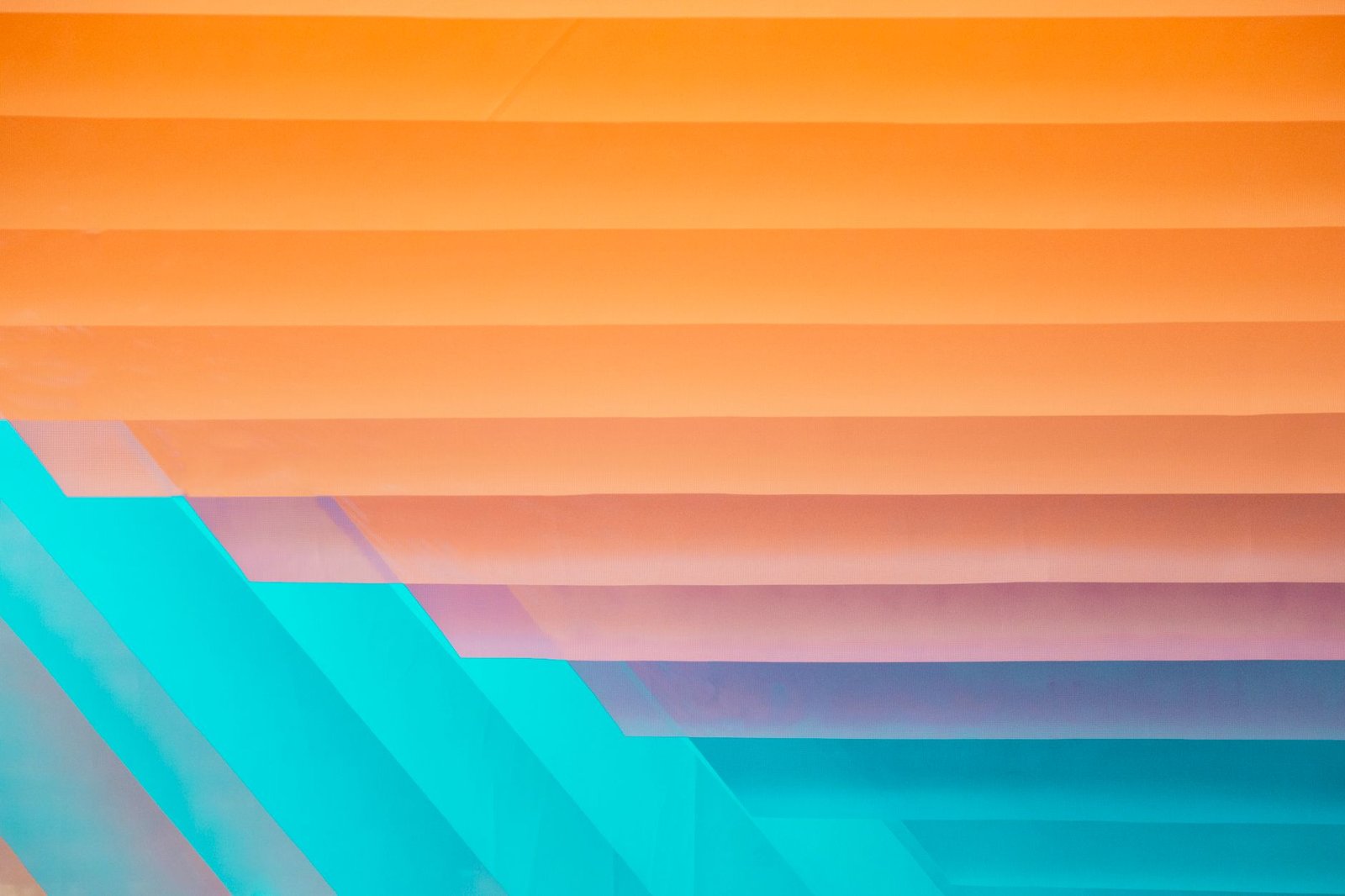
Digitally designed or photographically produced gradient prints, produced as fine art prints on high-quality paper or specialist printing substrates. The digital precision of gradient design allows for exactly calculated colour transitions — the smoothest possible gradient, without the slight variation of hand-painting. Abstract gradient prints are the most accessible and affordable form of gradient wall art and are available in virtually unlimited colour combinations and scales.
Gradient Textile Wall Art
Gradient art created in textile rather than paint or print — woven tapestries, macramé pieces, dip-dyed fabric panels, or hand-dyed textile hangings. Textile gradient art adds dimensional texture to the colour transition — the weave structure, the knot pattern, or the fabric surface creates visual depth that flat paint or print cannot. Textile gradient wall art has strong craft associations and works particularly well in naturalistic or bohemian interior contexts.
Painted Gradient Walls
Gradient art applied directly to wall plaster or drywall — an ombré paint effect that transitions from one colour to another across the full wall surface. This is the most dramatic and immersive gradient art approach — it literally changes the architecture of the room by turning an entire surface into a colour gradient. Particularly effective on feature walls or in rooms where the gradient colour can be echoed or complemented in furnishings and accessories.
Ceramic and Mixed-Media Gradient Art
Gradient effects applied in ceramic glazes, resin pours, mixed media on board, or through photographic processes. Each medium creates a different visual character — the depth and translucency of resin, the gloss variation of ceramic glaze, the opacity contrast of mixed media. These formats are typically smaller-scale and function as focal pieces within a gallery wall or as stand-alone accent pieces rather than as room-defining large-format art.
Colour Strategies for Gradient Wall Art
Matching the Room’s Existing Palette
The most integrated approach to gradient wall art: selecting colours that echo or complement the room’s existing palette. A room with warm wood tones and terracotta accessories might carry a warm amber-to-cream gradient art piece that amplifies the existing palette.
A cool-grey, north-facing room might carry a blue-to-steel gradient that deepens the room’s cool quality. The art becomes part of the colour conversation of the room rather than a standalone visual interruption.
Contrast Through Complementary Gradient
Using gradient art as a colour counterpoint — introducing tones that the room does not currently have in order to create warmth, depth, or visual complexity. A very neutral room (white walls, grey furniture, natural wood) can be given visual life through a gradient art piece in warm amber, coral, or deep blue without requiring any changes to the room itself. The art piece delivers the colour content the neutrals cannot.
Monochromatic Gradient
A gradient that moves through different values of a single colour — deep teal to sky blue, deep charcoal to light grey, burgundy to blush pink. Monochromatic gradient art is the most refined and architecturally integrated gradient approach — it functions as a sophisticated tonal study rather than a colour statement and suits minimalist or contemporary interior design contexts particularly well.
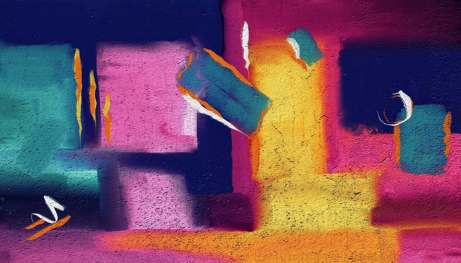
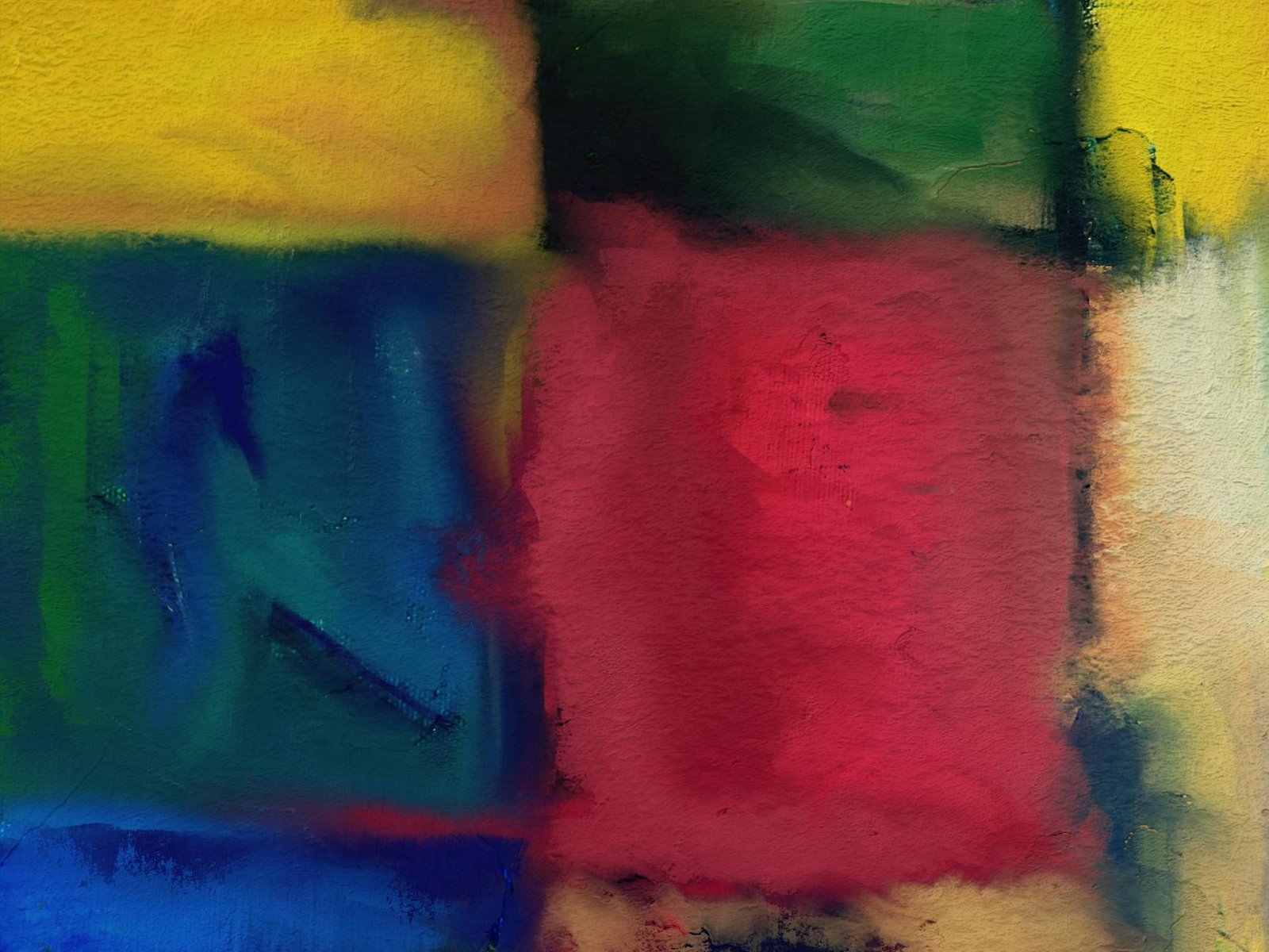
Maximalist Colour Gradient
A gradient that moves through multiple vivid, chromatic colours — a rainbow gradient, a sunset palette, a neon progression. This approach is a bold decorating choice that positions the art as the primary visual event in any room. Requires restraint everywhere else: plain walls, neutral furniture, and minimal competing colour in accessories and textiles.
The colour relationships that make gradient wall art work in an interior context — complementary contrast, analogous harmony, monochromatic value progression — follow the same principles as clothing colour combinations. Understanding colour blocking principles develops the same colour literacy that gradient art placement requires.
Placement and Scale for Gradient Wall Art
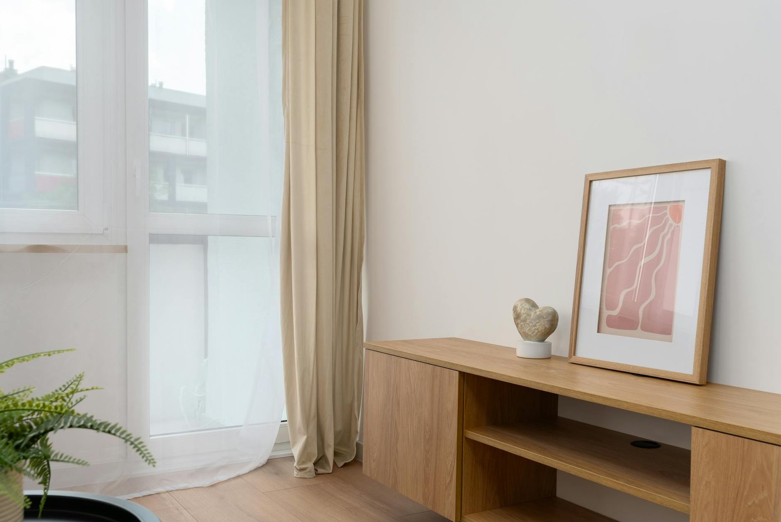
- Large-format single piece — a canvas or print 100cm or wider used as a room’s primary visual focal point. Works above a sofa, above a bed headboard, or on a feature wall. The scale allows the gradient to fully develop across the surface.
- Diptych or triptych — a continuous gradient split across two or three panels. The gaps between panels create visual rhythm within the gradient; the overall effect can be larger than any single canvas while maintaining flexibility of arrangement.
- Gallery wall with gradient coordination — multiple smaller gradient art pieces arranged together, coordinated by colour family or gradient direction. The gallery wall allows colour variation and texture variety while maintaining visual coherence through the gradient theme.
- Hallway and transition spaces — gradient art in narrow spaces like hallways creates colour experience in spaces that are typically overlooked. A tall, vertical gradient piece in a hallway creates a moment of colour absorption as people move through the space.
Gradient wall art creates the most impact when it is part of a considered room design rather than an isolated decorative choice. Our guide to gradient bedroom aesthetics covers how to build a complete room design around flowing colour transitions, from wall treatment choices to furniture and textile coordination.
Gradient Art Styles and Their Interior Contexts
- Colour field / minimalist — large-format, single or two-colour gradient with no additional visual content. Suits minimalist, Scandinavian, or contemporary interior design contexts.
- Painterly / expressive — visible brushwork within a gradient structure. Suits warmer, more eclectic or arts-and-crafts-influenced interior contexts.
- Digital precision gradient — mathematically smooth digital prints. Suits contemporary, design-led, or industrial-influenced interior design contexts.
- Textile/macramé gradient — woven or knotted gradient with tactile surface. Suits bohemian, naturalistic, or organic interior design contexts.
Interior design trends in 2025 and 2026 have moved toward warmer, more atmospherically considered spaces, creating a context where gradient art’s ability to generate mood through colour is particularly valued. Who What Wear’s guide to 2025 home décor trends covers the shift toward design that prioritises emotional resonance and personal expression over purely decorative choices.
Frequently Asked Questions
What is gradient wall art?
Gradient wall art uses smooth, flowing colour transitions — from one hue to another, or from deep to light within a single colour — as the primary visual element. It can be painted, printed, or created in textile, and ranges from small decorative prints to large-format room-defining canvases or full wall paint effects. The visual effect is atmospheric rather than representational — pure colour experience rather than depicted subject matter.
How do you style gradient wall art in a room?
Select gradient colours that complement or deliberately contrast with the room’s existing palette. Use large-format pieces (100cm+) as primary focal points above sofas or beds; use smaller pieces within gallery wall arrangements.
Avoid competing the gradient’s colour content with busy patterns in upholstery or textiles — gradient art works best against simplified background surfaces. The art should be the room’s primary colour statement, not one competing element among many.
What colours work best for gradient wall art?
For most interior contexts, monochromatic gradients (one colour shifting in value) or analogous colour gradients (adjacent colours on the colour wheel) are the most versatile and the easiest to integrate with existing interior palettes. Bold complementary or rainbow gradients are powerful but require more careful overall room styling. Warm gradient palettes (amber, coral, terracotta progressions) add warmth to cool or neutral rooms; cool gradient palettes (blue, teal, green progressions) add calm and depth to warm rooms.