Color Theory in Fashion: How to Build Outfits That Work Using Color Science
Why Color Theory Matters in Fashion
Most people who dress well intuitively apply colour theory principles without knowing the formal framework behind their decisions. Understanding colour theory explicitly gives you the vocabulary and the logic to make deliberate colour decisions rather than trial-and-error ones, to understand why a combination that looked right in your head looks wrong on your body, and to explore new colour territory with confidence rather than caution.
Colour theory is not a set of rules that constrain creative choices — it is a framework for understanding why colour combinations create the visual effects they do. Once you understand the principles, you can use them to achieve your intended effects deliberately, or violate them deliberately for aesthetic reasons. The difference between an accidental colour mistake and an intentional one is understanding what you are doing and why.
The Colour Wheel and Fashion
The colour wheel organises colours by their relationships to each other. In fashion, the most relevant relationships are:
Complementary Colours
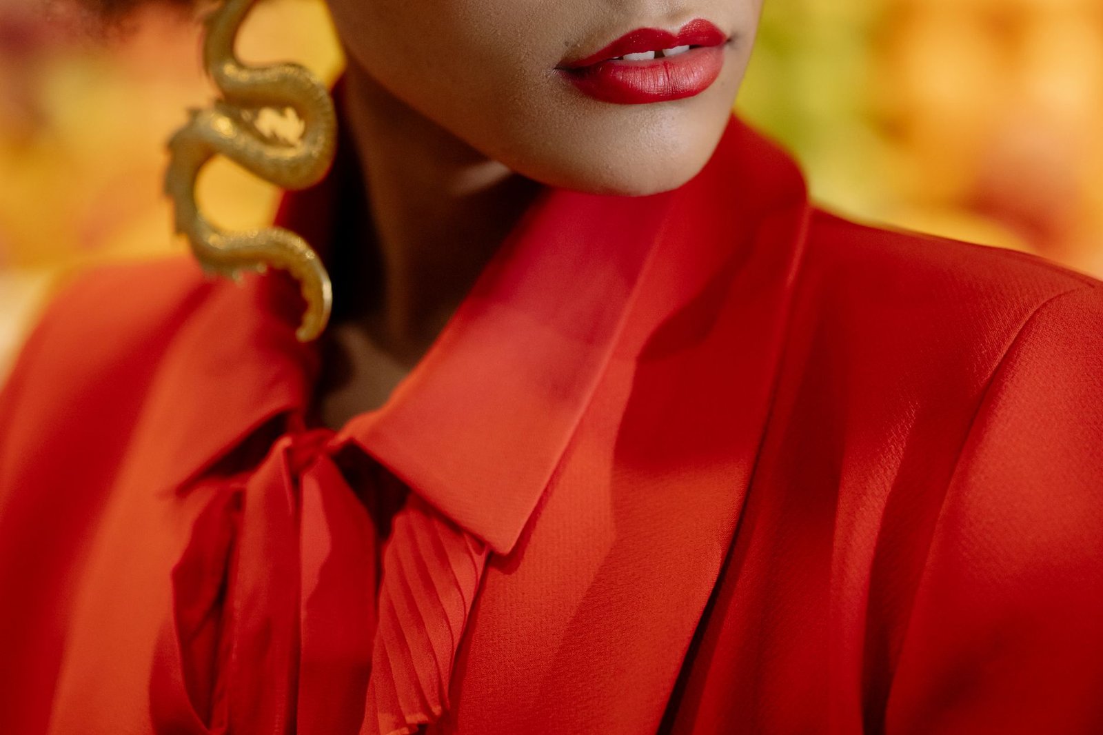
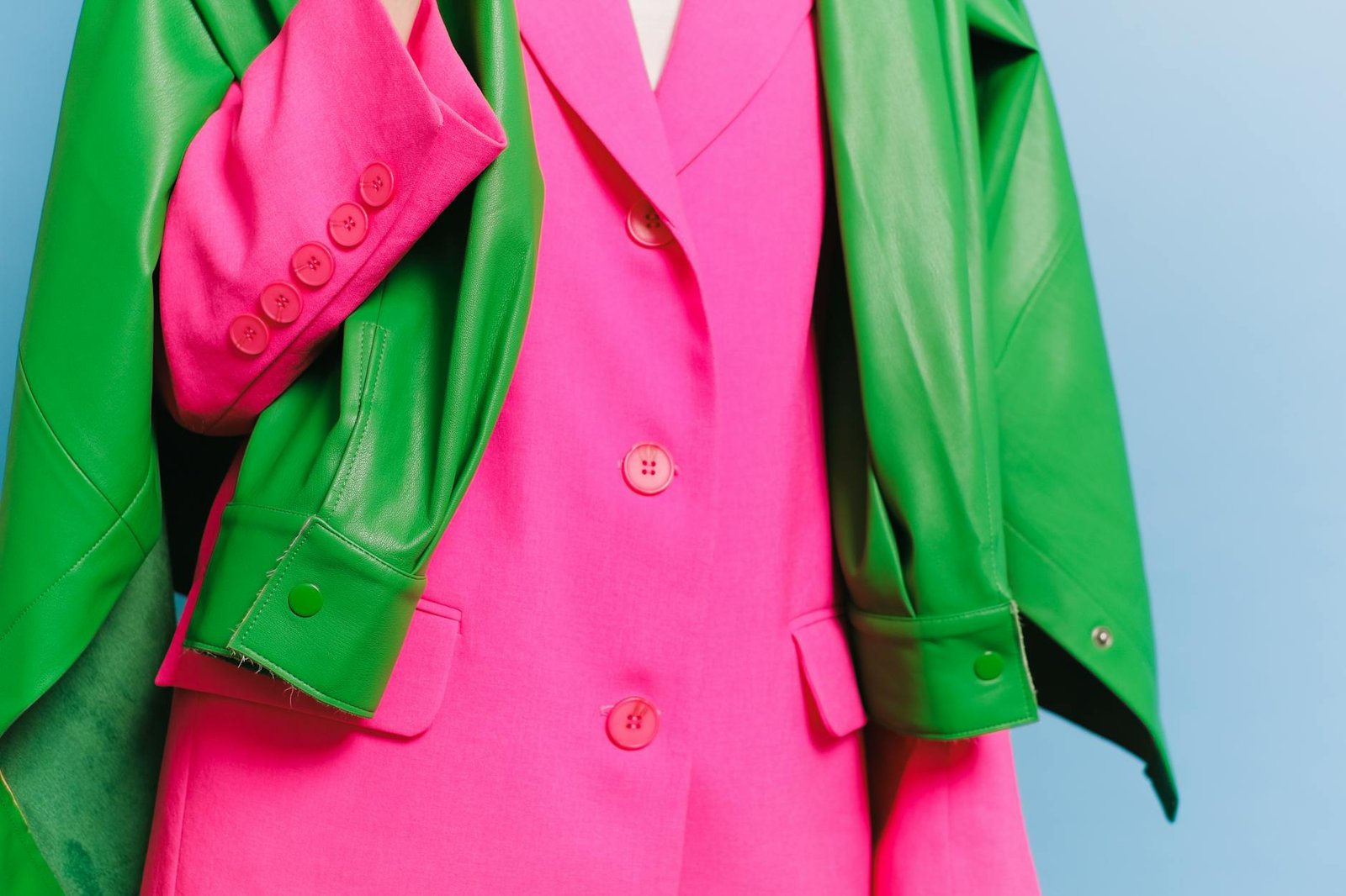
Complementary colours sit directly opposite each other on the colour wheel: red and green, blue and orange, purple and yellow. Complementary colour pairs create maximum contrast — each colour makes the other appear more vivid by the simultaneous contrast effect.
Complementary colour combinations in fashion are high-energy and visually active. They require balance in the proportion of each colour: unequal amounts (one dominant, one accent) are more wearable than equal fifty-fifty splits, which can feel aggressive or unresolved.
Fashion examples: a cobalt blue dress with orange shoes and bag accents; a forest green coat with burgundy knitwear showing at the collar; burnt orange trousers with a deep blue tee.
Analogous Colours
Analogous colours are adjacent on the colour wheel: yellow, yellow-orange, and orange; blue, blue-purple, and purple. Analogous colour combinations share tonal relationships and blend harmoniously because the colours are close enough to feel related. Analogous palette outfits are easy to assemble and reliably successful — they feel cohesive and considered without requiring the precision that complementary combinations demand.
Fashion examples: an all-warm outfit in rust, terracotta, and amber; a cool blue-to-purple gradient outfit; a warm pink to coral combination.
Triadic Colours
Triadic colour combinations use three colours evenly spaced around the colour wheel: red, yellow, blue (the primary triad); orange, green, purple (the secondary triad). Triadic combinations are vibrant and balanced because no one colour dominates the relationship. In fashion, triadic colour outfits are bold and memorable but require careful proportion management — one dominant colour and two accent colours rather than equal distribution across all three.
Monochromatic

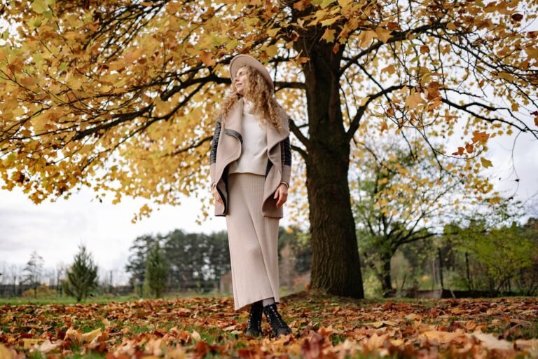
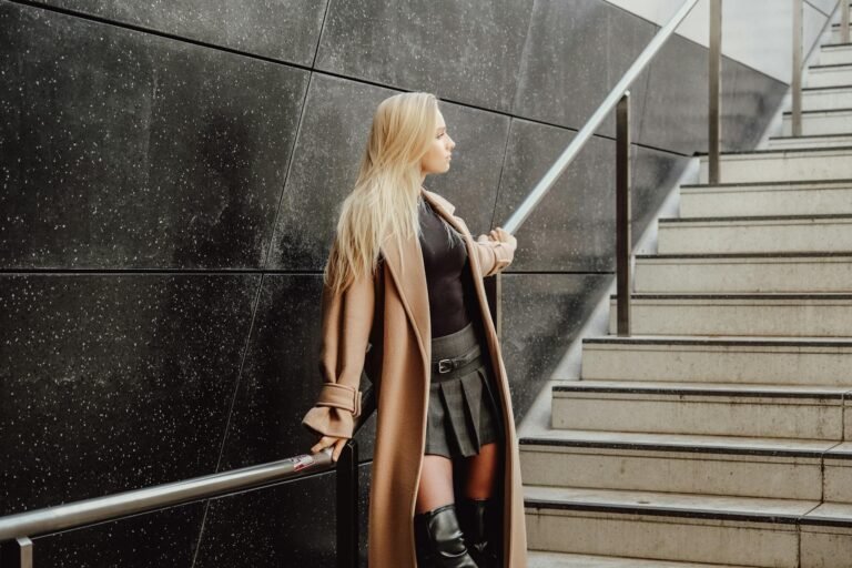
A monochromatic colour scheme uses a single colour in multiple values and saturations — deep navy through medium blue to pale sky blue; deep forest green through sage to mint. Monochromatic outfits are sophisticated and visually cohesive; the interest comes from texture, proportion, and value variation rather than colour contrast. The most challenging aspect of monochromatic dressing is finding pieces that match closely enough in hue while differing enough in value to create perceptible variation.
Split-Complementary
A split-complementary scheme uses one colour and the two colours adjacent to its complement — blue with red-orange and yellow-orange, rather than blue with straight orange. This creates colour contrast similar to complementary combinations but with more tonal harmony because the two accent colours are related to each other. Split-complementary colour outfits have more visual complexity than straight complementary combinations and are often more wearable because the three-colour relationship is richer.
Value and Saturation in Fashion
Value (Light and Dark)
Value describes how light or dark a colour is, independent of its hue. Dark navy and pale sky blue are both blue but at very different values. Value contrast in an outfit creates visual definition — high contrast (very dark and very light pieces together) creates bold, clearly delineated silhouettes; low contrast (pieces in the same value range) creates a tonal, soft visual effect.
The most common value contrast strategy in fashion is dark bottom and light top (or the reverse) — creating a horizontal visual break at the waist that defines the silhouette. Tonal outfits that use pieces in the same value range create a lengthening vertical effect because the eye reads the outfit as a unified surface rather than segmented blocks.
Saturation (Intense and Muted)
Saturation describes how intense or vivid a colour is. A vivid red is highly saturated; a dusty rose is desaturated.
Mixing highly saturated and desaturated colours in the same outfit creates tension: the vivid colour overwhelms the muted one and makes it read as faded or incomplete. Effective saturation management keeps pieces within a similar saturation range — all vivid, all muted, or a deliberate accent of vivid against a muted ground with the understanding that the vivid piece will dominate visually.
Colour Temperature in Fashion

Colour temperature describes whether a colour feels warm (yellows, oranges, reds, warm browns) or cool (blues, greens, purples, cool greys). Temperature-consistent outfits — all warm or all cool — feel coherent because the colours share an atmospheric quality. Mixed-temperature outfits can work when the contrast is deliberate (a warm rust accent against a cool grey base) but often feel unresolved when the temperature mixing is accidental.
Skin tone and colour temperature: people with warm skin undertones (golden, peachy, or olive) are typically most flattered by warm-temperature colours; people with cool undertones (pink, blue, or purplish) are typically most flattered by cool-temperature colours. Understanding your own undertone guides which colour families will create the most harmonious contrast with your skin.
Neutral Strategy in Fashion Colour
Neutrals — black, white, grey, navy, camel, and tan — are the foundation of most wardrobe colour strategies because they create a visual resting point around which coloured pieces can operate. The most useful neutral strategy in fashion:
- Black neutralises all colours — black creates strong contrast and value definition against any colour
- White brightens adjacent colours — white makes neighbouring colours appear more vivid by contrast
- Warm neutrals (camel, tan) harmonise with warm colours — and create subtle discord with cool colours
- Cool neutrals (grey, cool white) harmonise with cool colours — and can create tension with warm colours
- Navy is not a neutral — navy has strong colour temperature (cool) and hue content (blue) and does not function as a neutral in the same way that black or grey do
Practical Colour Theory Outfit Applications
- Building a gradient outfit (analogous colour flow from one shade to another) — use analogous palette relationships
- Creating a bold colour statement — use complementary combination with unequal proportions
- Achieving maximum tonal sophistication — use monochromatic scheme with value variation
- Making a coloured piece pop — place it against its complementary colour or against a strong neutral
- Creating a calm, cohesive outfit — use analogous or tonal strategy with consistent saturation levels
Frequently Asked Questions
What is colour theory in fashion?
Colour theory in fashion applies the principles of the colour wheel — complementary, analogous, triadic, and monochromatic colour relationships — along with value (light/dark) and saturation (vivid/muted) principles to the question of how to combine colours in an outfit. Understanding these principles allows deliberate colour decision-making rather than intuitive trial and error.

What colours go together in outfits?
The most reliable combinations are analogous (colours adjacent on the colour wheel, like blue-green-teal), monochromatic (one colour in multiple values), and complementary with unequal proportions (one dominant, one accent colour from the opposite side of the colour wheel). Keeping saturation levels consistent across pieces and choosing colour temperatures that are internally coherent (all warm or all cool) creates the most reliably harmonious outfit combinations.
How do you apply the colour wheel to fashion?
Identify the primary colour or colour family of the piece you are building an outfit around. Then select coordinating pieces from one of the colour wheel relationships: adjacent colours for analogous harmony; the colour directly across the wheel for a complementary accent; or stay within the same colour family at different values for a monochromatic approach. Check that the saturation levels of each piece are similar, and verify that the colour temperatures (warm or cool) are internally consistent before finalising the combination.