Mixing Prints Outfits: The Rules for Combining Patterns That Actually Work
Why Mixing Prints Is One of Fashion’s Most Rewarding Skills
Mixing prints in an outfit creates visual complexity that no single-pattern look can achieve — a dynamism and personality in the dressing that communicates genuine fashion confidence and knowledge. But it is also one of the highest-risk styling manoeuvres: done without understanding the rules that make it work, the result is visual chaos rather than intended complexity. Understanding when and how print mixing succeeds is one of the most useful skills in contemporary dressing.
The principles that govern successful print mixing are not arbitrary fashion rules — they are visual perception principles. Understanding why certain combinations work and others don’t gives you the judgment to create new combinations confidently rather than following a checklist.
The Core Rules of Print Mixing
Rule 1: Scale Contrast
The most reliable print mixing rule: combine a large-scale pattern with a small-scale pattern from the same or harmonious colour family. The scale difference creates visual separation between the prints — the eye reads them as distinct elements rather than competing equals.
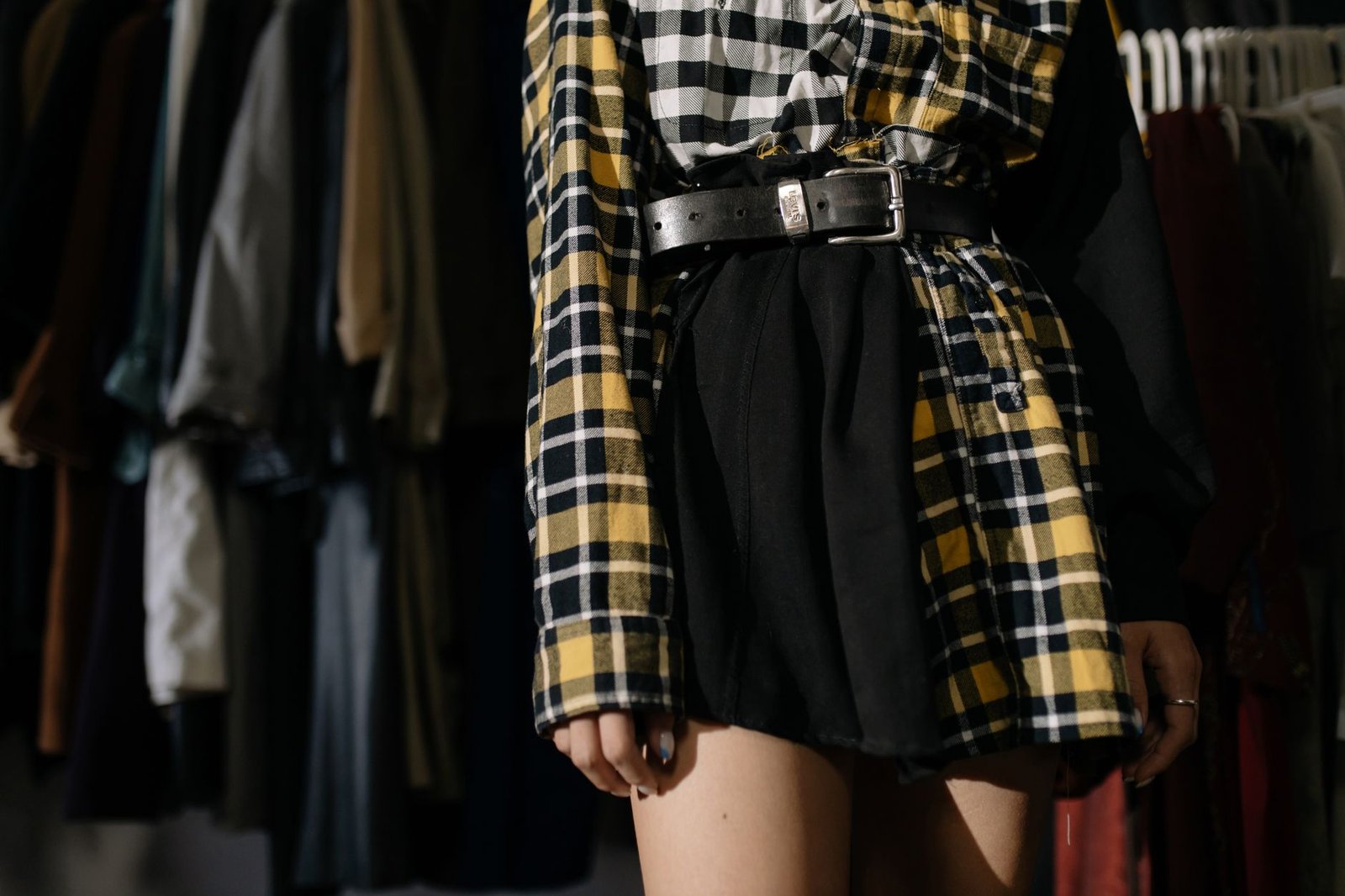
A bold large-scale floral with a small-scale micro-stripe. A large check with a fine houndstooth.
A wide plaid with a tiny polka dot. Scale contrast is the single most important rule in print mixing and the one that saves the most otherwise-problematic combinations.
Rule 2: Colour Family Unity
The prints in a mixed-pattern outfit should share at least one colour — or belong to compatible colour families. When both prints contain the same colour (even if it plays different roles in each pattern), the eye reads a visual connection between them that makes the combination feel intentional.
A navy and white stripe with a navy, white, and red check — the shared navy and white creates cohesion. A terracotta floral with an olive and terracotta plaid — the shared terracotta ties them.
The colour family unity principle in print mixing is rooted in the same logic as outfit colour theory more broadly. Understanding colour temperature and saturation — keeping mixed prints in the same saturation range, or ensuring their shared colour appears in compatible temperature registers (both warm or both cool) — makes the difference between a combination that feels cohesive and one that feels accidentally chaotic.
Rule 3: Pattern Type Differentiation
Combine different pattern types rather than two examples of the same pattern type. A stripe and a floral work better together than two different florals, because the geometric logic of the stripe and the organic logic of the floral create natural visual distinction.
A check and a spot work better than a check and a plaid. Pattern type combinations that reliably work: stripe + floral, check + spot, plaid + abstract, geometric + organic.
Rule 4: One Dominant Print
In a print mixed outfit, one print should dominate visually and the other should support. Equal visual weight between two strong patterns creates competition rather than harmony.
The dominant print is usually the piece that occupies more visual territory (the trouser or skirt rather than a tucked shirt) or has the bolder scale or colour contrast. The supporting print is more restrained — smaller scale, softer colour contrast, or less visual surface area.
Print Mixing Combinations That Always Work
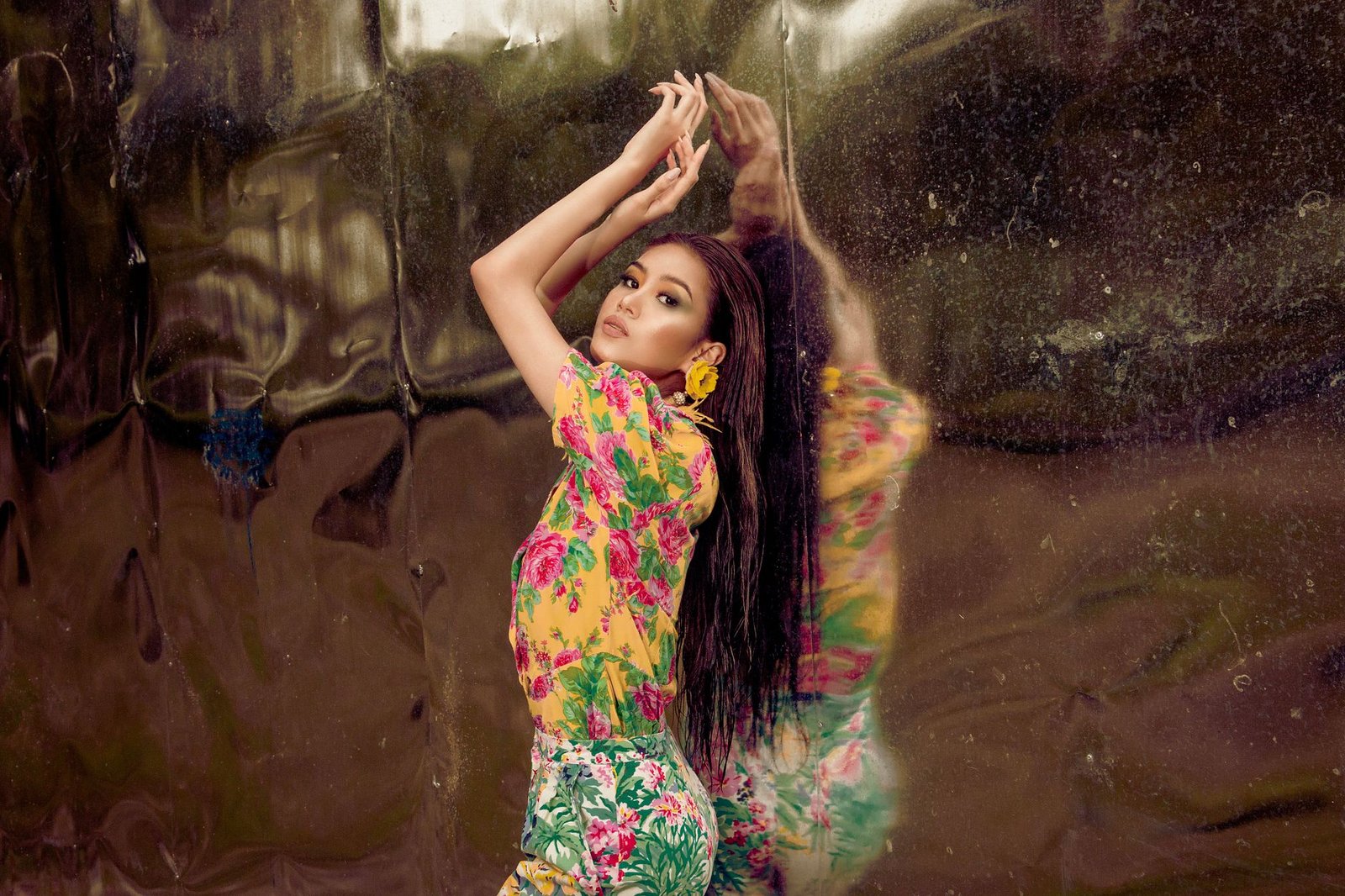
Stripes and Florals
The classic print mixing combination and the one with the longest fashion history. A stripe and a floral read immediately as intentional mixing rather than accidental pattern collision — the geometric logic of the stripe and the organic logic of the floral create so much visual contrast in pattern type that even imperfect colour matching is forgiven. Works best when the stripe colours appear in the floral, or when both prints share a white or neutral ground.
Check and Spot

A checked pattern (tartan, plaid, gingham, windowpane) with a spot or polka dot pattern. The grid structure of the check and the scattered structure of the spot create a satisfying formal contrast. Scale matters here: a large bold check with a small dot, or a large scale spot with a fine narrow check.
Animal Print as a Neutral
Animal prints — leopard, snake, zebra — function as neutral accessories rather than competing patterns when used at small scale (a scarf, a bag, shoes or boots). Leopard print in particular has a status as a quasi-neutral in print mixing because its colour complexity allows it to pick up and harmonise with almost any other pattern’s colour range. Treat animal print as a sophisticated neutral and pair it with bolder graphic prints or stripes with confidence.
Tonal Pattern Layering
Multiple patterns within a single colour family create tonal visual complexity without chromatic competition. All-navy: a navy and white stripe shirt under a wide navy check blazer with a navy spot pocket square.
All-cream and beige: a tone-on-tone approach where all patterns are in the same value range. This is the most restrained form of print mixing and the one that can be taken furthest without risk — the tonal unity acts as a safety net.
The preppy aesthetic is one of fashion’s most historically well-developed traditions of print mixing — the combination of Oxford-stripe shirts under plaid or check blazers, madras shorts with Breton-striped tops, and argyle knitwear layered with plain-colour chinos all demonstrate the tonal approach to print combination that works consistently. The preppy aesthetic outfit guide covers these combinations in detail.
Outfit Ideas for Mixing Prints
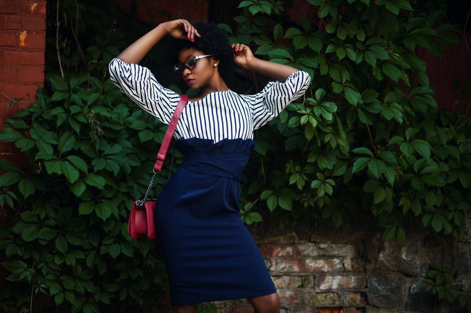
Classic British Mix: Stripe and Check
A thin Breton stripe top under an open check overshirt or shirt, with plain denim or dark trousers. The stripe provides the base layer; the check is the outer statement.
Shared colours in the two patterns (both use navy and white, for instance) create coherence. This combination has deep roots in British fashion culture — particularly associated with the mod and Britpop aesthetic worlds — and reads as fashion-confident without being confrontational.
Smart Print Mix: Floral Shirt Under Plaid Blazer
A floral shirt with the collar visible above the lapels of a plaid or check blazer. The floral at the shirt level, the plaid at the jacket level — scale differentiation and the dominance of the blazer visual mass over the shirt creates a hierarchy that makes the combination read as deliberate. The floral shirt is visible at cuffs and collar, providing accents of the smaller-scale organic pattern against the geometric check.
Maximalist Fashion Print Mix
For bolder styling: a bold large-scale abstract print skirt or trouser with a different bold print top — tied together by a shared colour. This requires genuine commitment to the combination and restraint in the rest of the outfit: no competing accessories, clean footwear, and no additional pattern elements. The bold print mix is the outfit statement, and everything else should create a clean visual environment for it.
Accessory Print Addition to Plain Outfit
The most accessible introduction to print mixing: a printed scarf or a printed bag added to an otherwise single-print or plain outfit. A leopard-print scarf with a narrow stripe shirt.
A floral bag with a checked jacket. The accessory print creates the visual relationship without requiring the full commitment of two garment prints.
Prints That Are Difficult to Mix
- Two large-scale florals — unless very carefully colour-coordinated and differentiated by exact scale, they compete for the same visual territory
- Two checks in different colour families — the geometric similarity and colour dissonance creates visual friction
- Two very loud, saturated graphic prints — the combination creates visual overload with no dominant focal point
- Print scales that are too similar — two medium-scale patterns of any type are the hardest to mix successfully because there is insufficient scale contrast for the eye to read clear visual hierarchy
For practical inspiration on print and colour combinations worth trying, Marie Claire’s guide to spring 2026 colour combinations demonstrates how designers are approaching unexpected pairings — combinations like chartreuse with burgundy or chocolate brown with baby blue — that apply the same scale-and-colour logic as successful print mixing.
Frequently Asked Questions
How do you mix prints without looking chaotic?
Three principles: scale contrast (combine a large-scale and small-scale pattern), colour family unity (both prints should share at least one colour), and pattern type differentiation (combine a geometric pattern with an organic or abstract one). Applying these three principles together creates print combinations that read as considered rather than accidental. Keeping one print as the clear dominant visual element and the other as supporting completes the framework.
What patterns go well together?
The most reliable print mixing combinations are: stripe and floral, check and spot, animal print as a neutral paired with any geometric or stripe, and tonal layering of multiple patterns within the same colour family. These combinations work because they either provide clear scale contrast, pattern type differentiation, or both — the visual mechanisms that allow the eye to distinguish and appreciate two patterns simultaneously rather than experiencing them as competing noise.
Can you wear two patterns at once?
Yes — with attention to scale, colour harmony, and pattern type. Two patterns at the same scale, in competing colour families, and of the same pattern type (two bold florals, two similar checks) are the most difficult combinations to make work.
Two patterns with scale contrast, shared colour elements, and different pattern logic (geometric plus organic) are the most visually successful. Build your pattern mixing confidence by starting with one reliable combination (stripe and floral with shared colours) and expanding from there.